the Canva of product design
Client
Uizard
Status
Live
Story
4 min read | Written by a human 🧔
Don't scroll!
stage 01
setting the scene
raising $15M
Scene 02|02 - my role
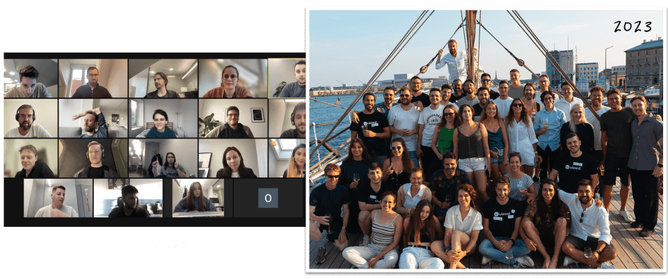
I was hired to develop the web app and create the design system from scratch in a time of growth in the company scaling from 15 to 54 at the time I left.
stage 02
rising action
time for growth
Scene 01|04 - business objectives
- Grow the number of users (Jan 2022, 167,793 signups)
- Increase the number of functionalities and the value of Uizard to retain our users
Scene 02|04 - a design problem
How to maintain design consistency and create a user-friendly platform while adding a tsunami of new functionalities to the product?

Scene 03|04 - the audience
Business-wise, this part is challenging to define as, at first, the focus was on all potential non-designers (students, early-stage startups…). However in order to be financially sustainable, the main target has narrowed down to companies with profiles like PM, business owners...
Scene 04|04 - challenge
Like most digital products the app has been through many iterations but needed functionalities and a design system. Collaboration-wise, the team was not cross-functional, designers were delivering features, which were reviewed by the technical founder and then distributed to the developers.
stage 03
climax
facing the waves
Scene 01|03 - unifying the design team
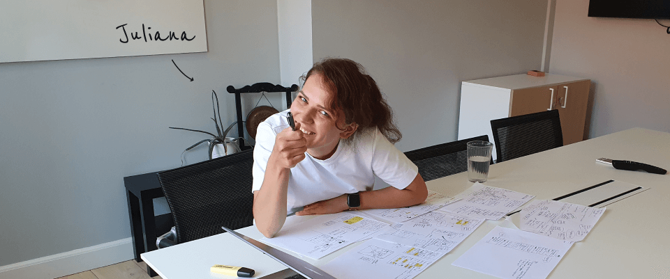
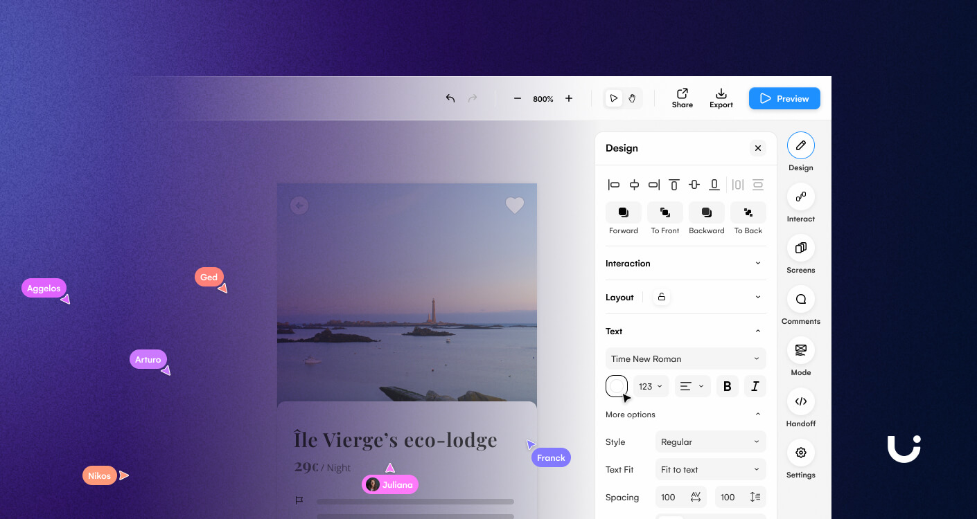
For 1 year and a half, we were only 2 product designers but switching from Sketch to Figma naturally helped us to be aligned and build new processes together. Due to high demand in product design, we decided to move Juliana from template design to product design but starting as a junior someone had to stand out to support her…
Scene 02|03 - not so cross-functional
Every company has its processes and evolves differently. At Uizard, we started in a vertical manner as functional teams. While it was working with a few people, the more we were growing, the more it was challenging. Annotations / prototypes / guidelines / videos were key to explaining our decisions to developers but were time-consuming and didn’t help to strengthen our professional relationship despite our friendships. Keep growing meant that cross-functionality would have to happen but when?
Scene 03|03 - slowly knowing the users
User research was unfortunately not a priority for some time, a behaviour I have seen happening before. So working with the tools I had has been key in my career. Ultimately not everything needs to be about user research and once you understand the user’s main goals, you can work with your weapons (design knowledge, OS guidelines and benchmarking…)
Reading feedback was handy but the best for us was to use Uizard and listen to our template designers who were using the software all the time.
End of 2023 however everything changed…
stage 04
solving the problem
spotlight on a few features
Scene 01|04 - disclaimer
As a disclaimer, the features I will present have been made in collaboration between 3 product designers. Even if I have pushed the needle further for these, it always has been a joint effort, even after switching into squads.
Scene 02|04 - right sidebar - design
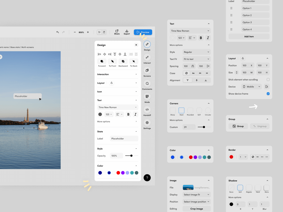
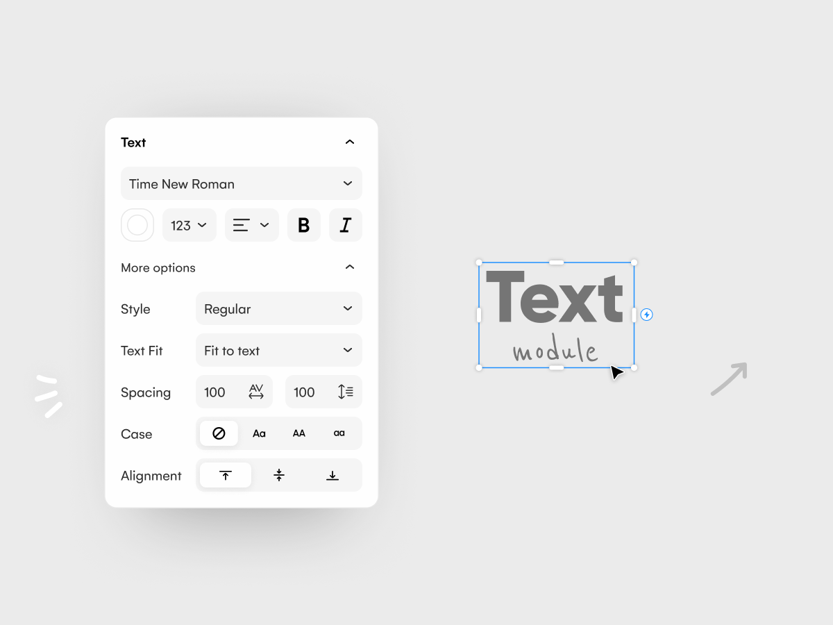
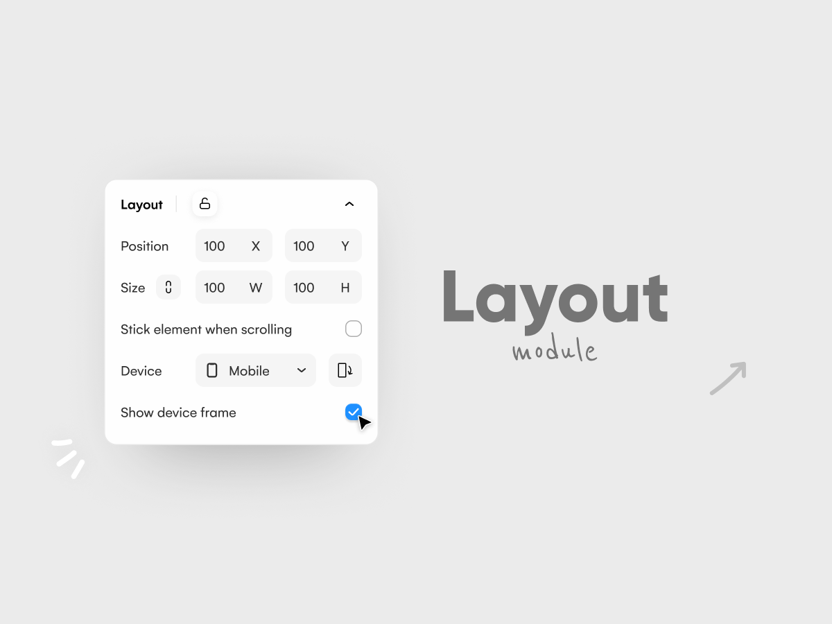
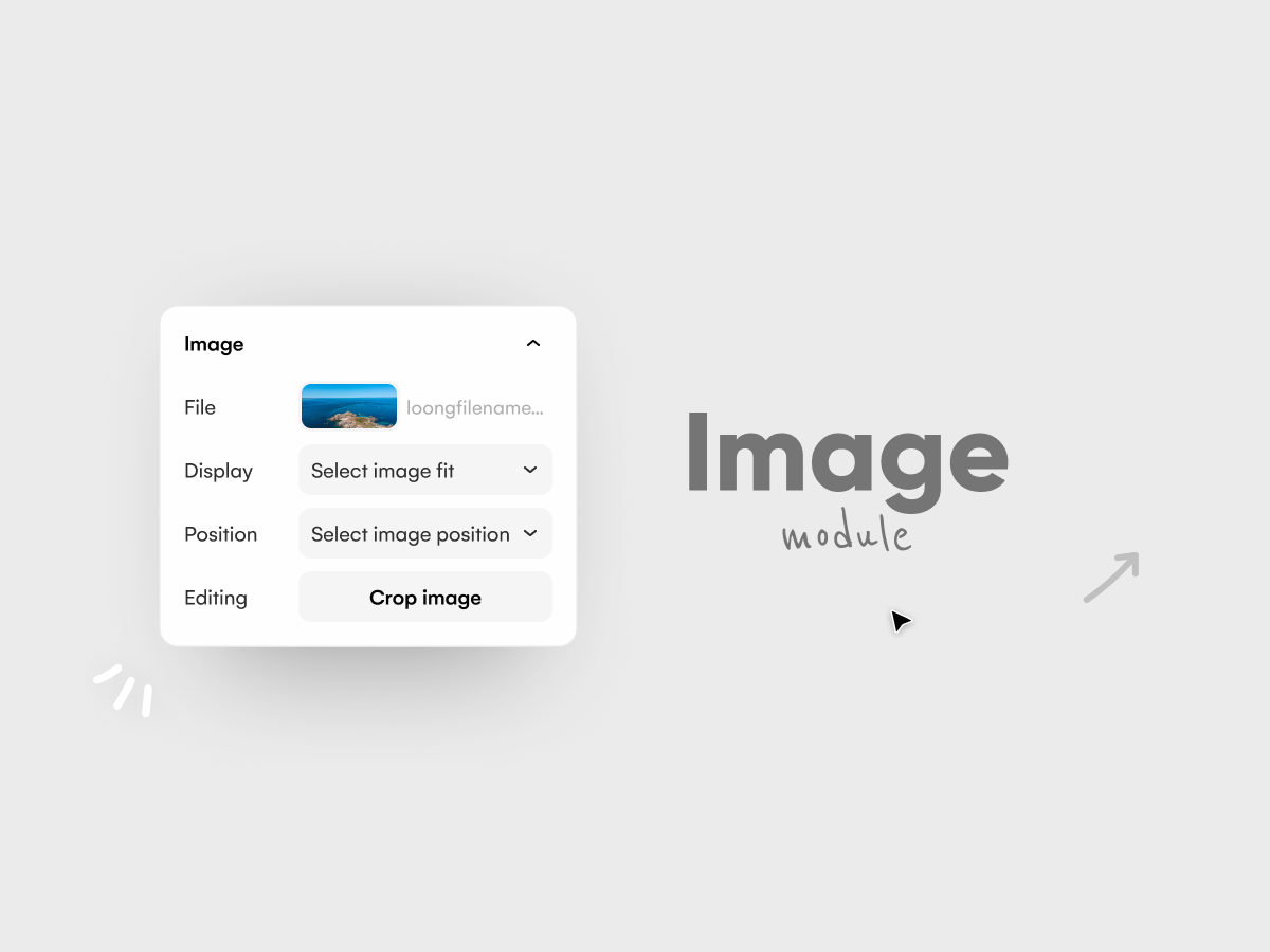
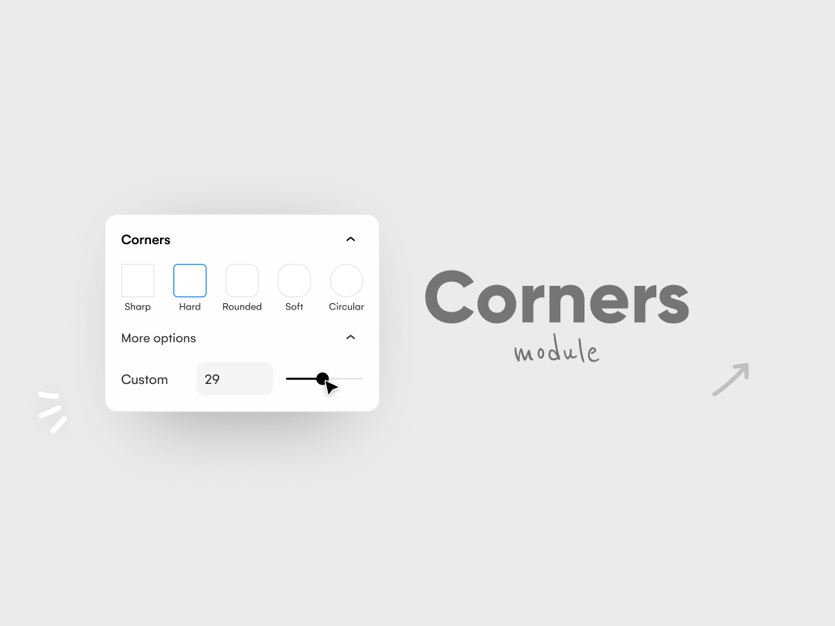
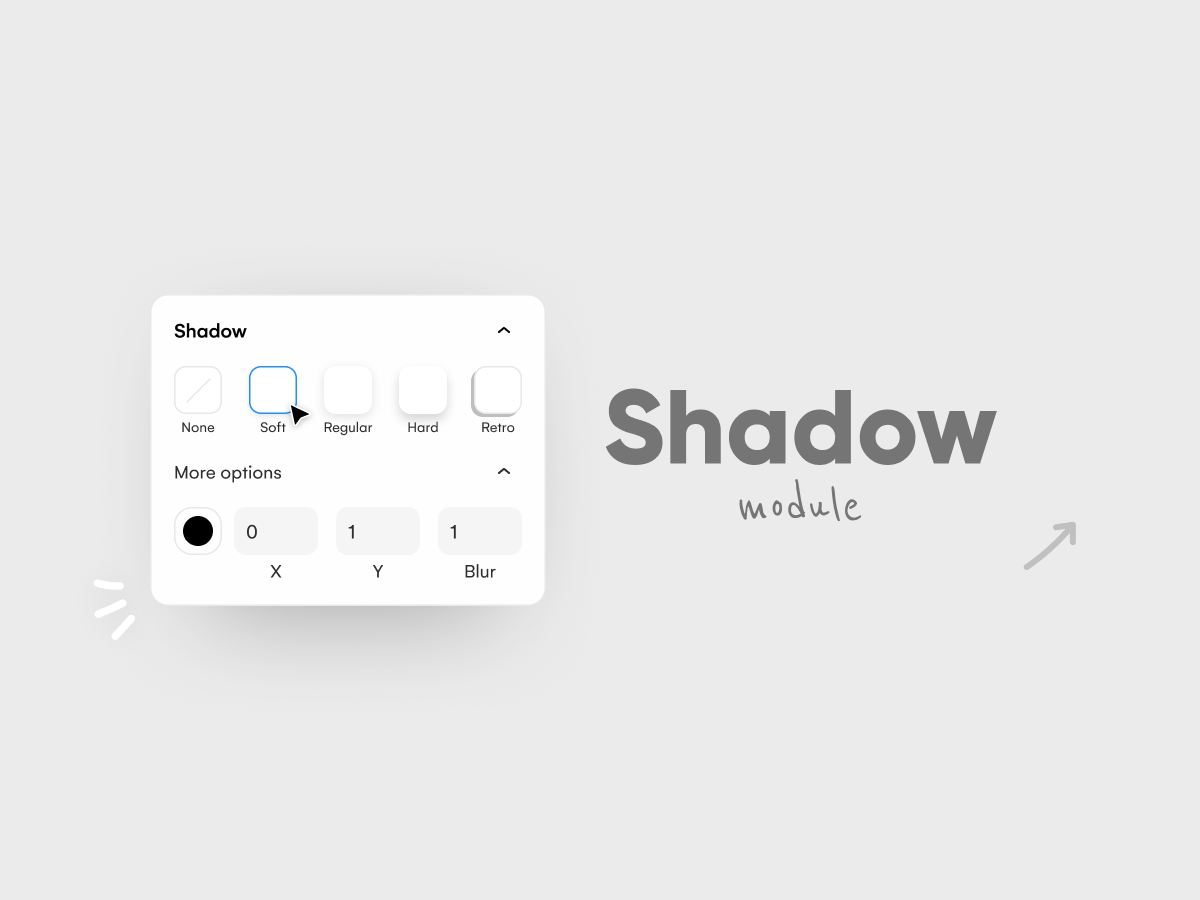
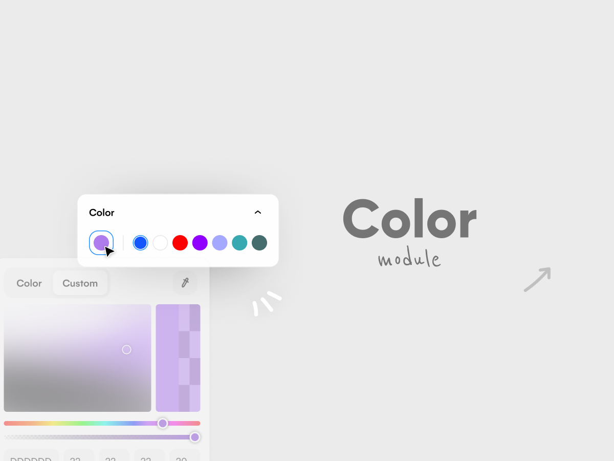
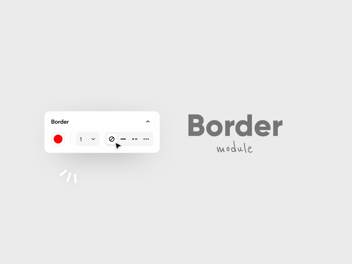
All the functionalities to design screens are gathered in this sidebar. As expected with growth, finding those functions became more tedious. Lacking resources to incorporate a deep user research, we played with our weapons, gathered feedback and asked our template designers. The problem was obvious but the design was challenging; splitting content with sections and compacting the sidebar were our answers for our users to find functions more quickly. Prototypes were tested with our template designers and improvements were brought with iterations.
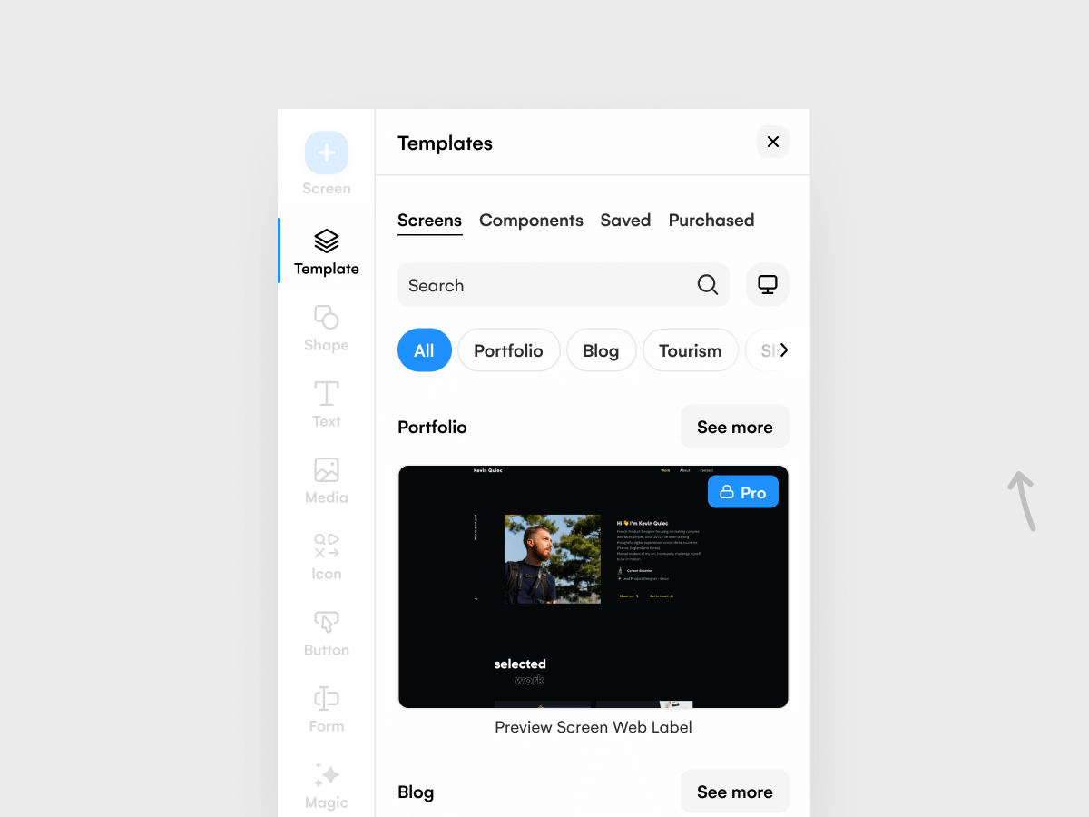
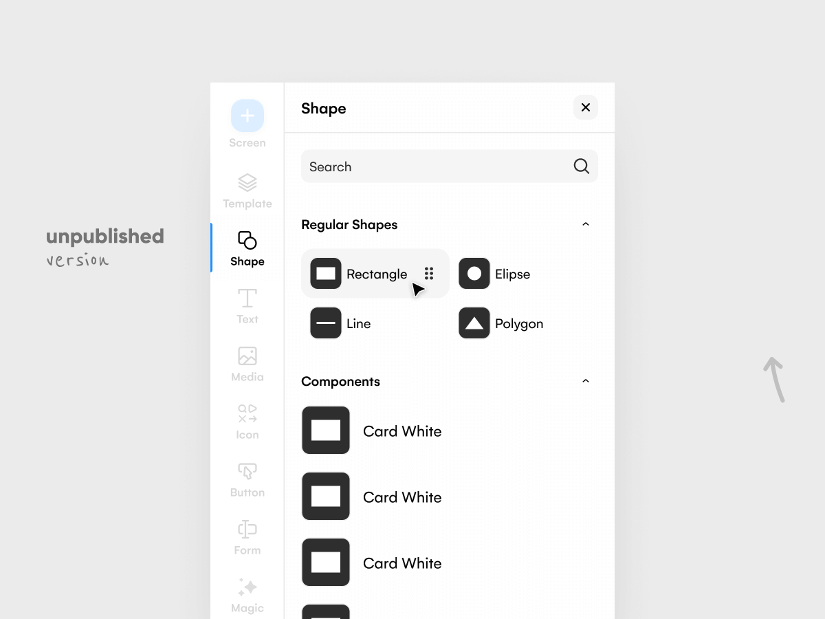
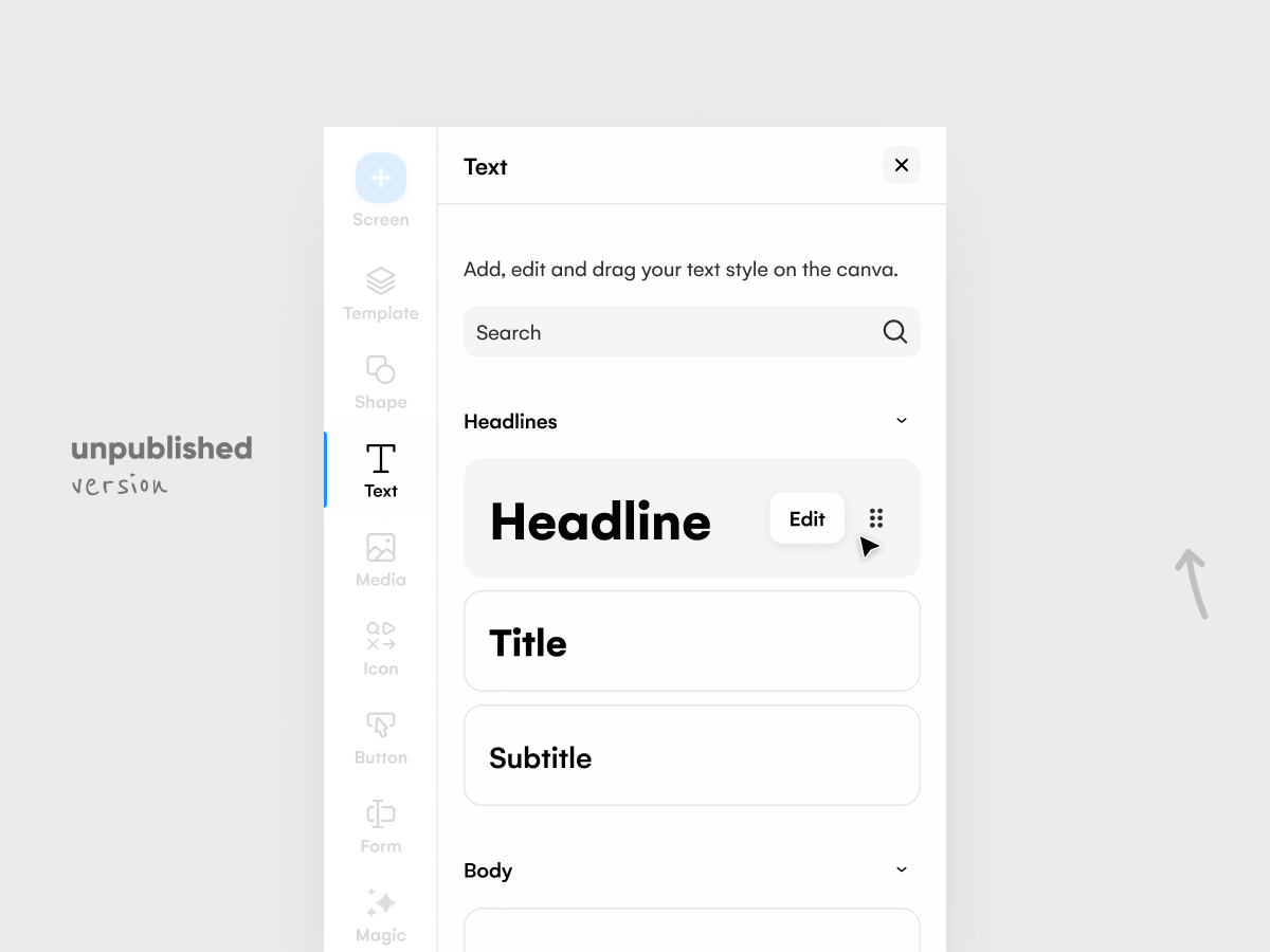
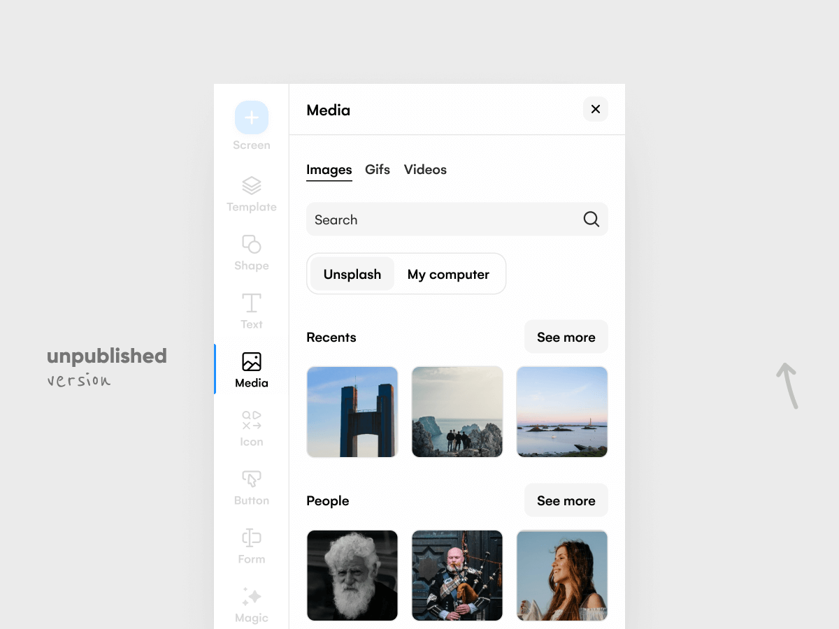
Scene 03|04 - left sidebar
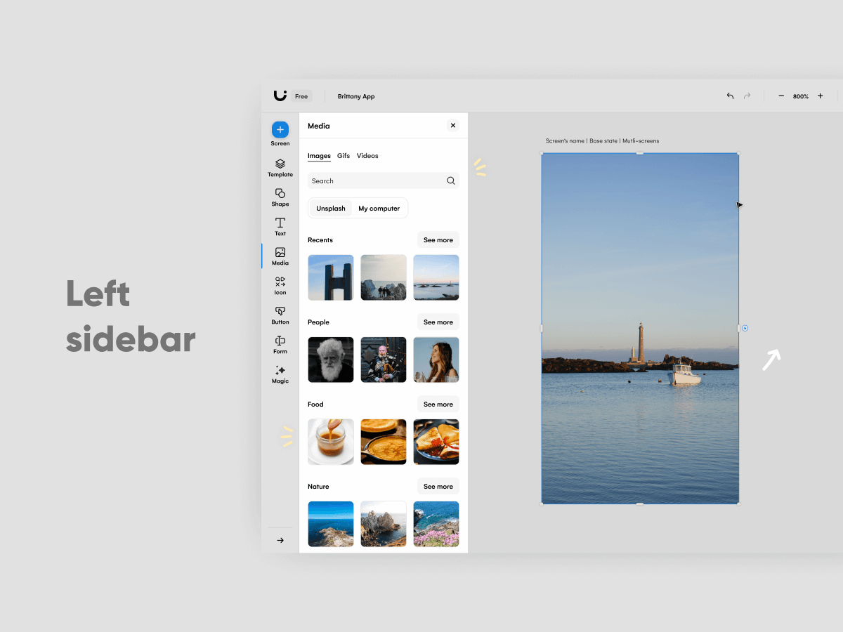
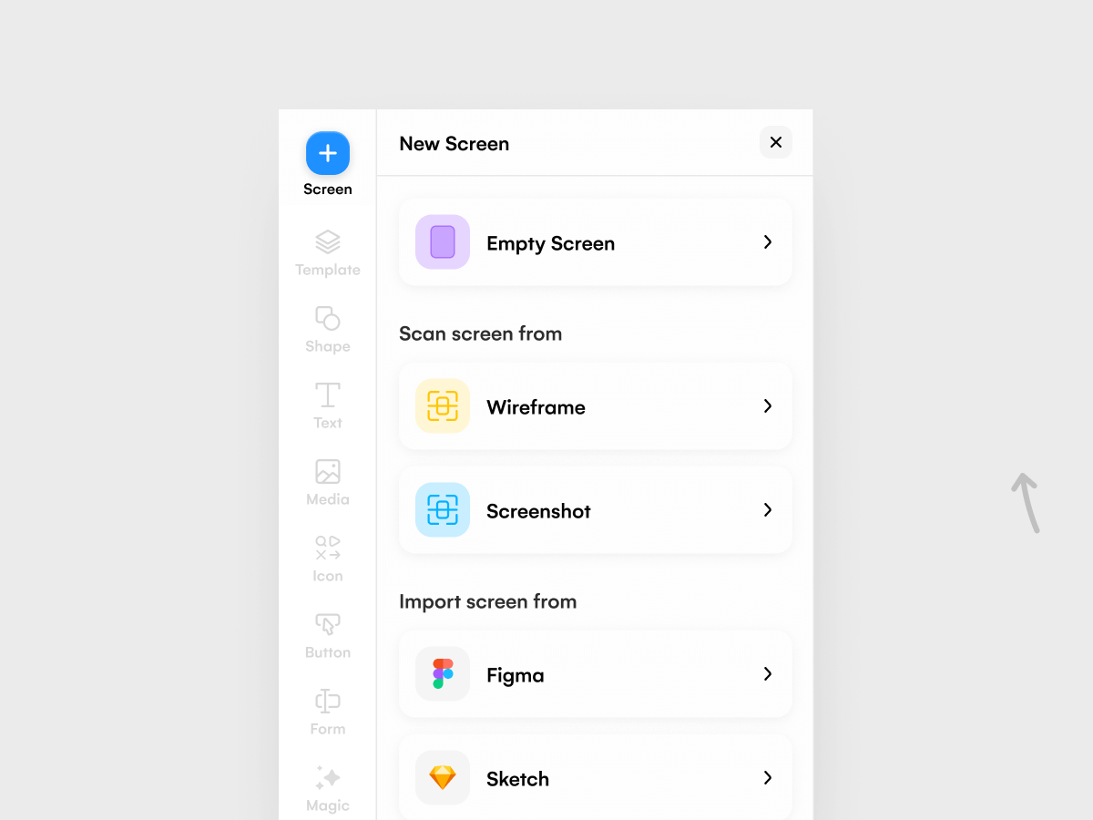
While the right sidebar allows you to customise your design, the left sidebar offers you existing components, screens and AI functionalities. With these design shortcuts, the idea is to sell components and encourage subscriptions. Our goal to offer a user-friendly experience was to display those assets for sale while giving away free ones or leveraging open API to make it a tool for everyone. Free users could one day become paid ones.
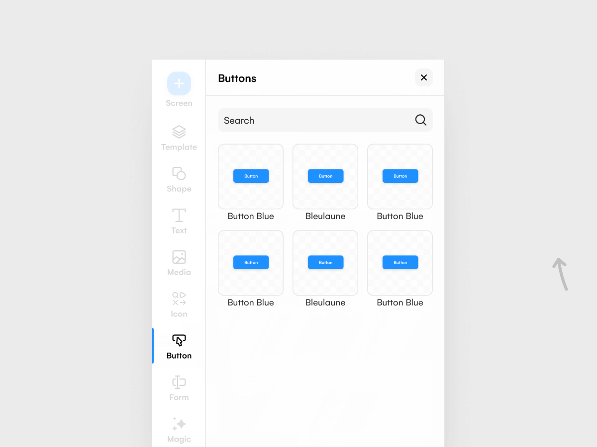
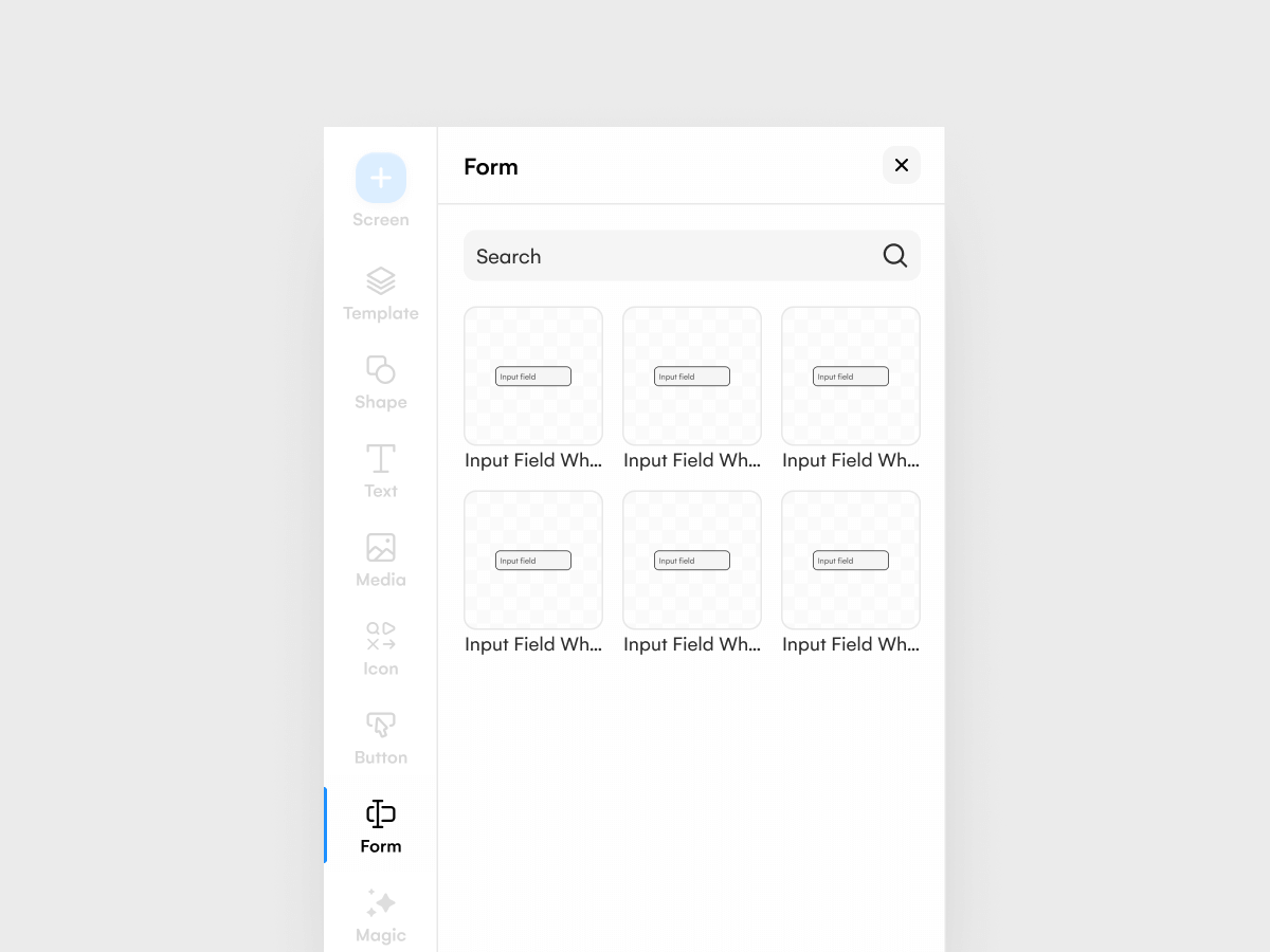
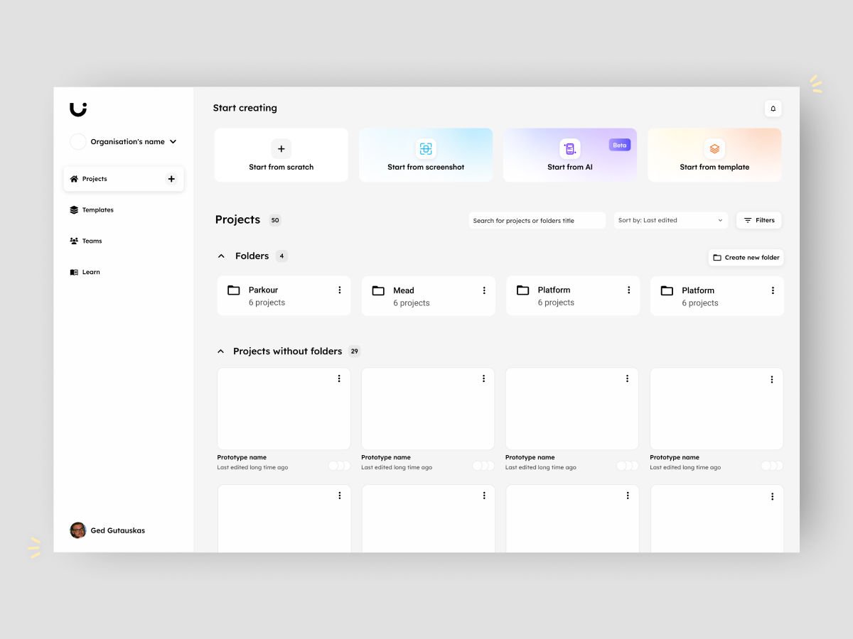
Scene 04|04 - folders
Targeting North America and Europe, we found out that only 409 paying teams had more than 1 creator on a total of 8.517 paying organisations, representing 4,8%. Every paid creator represents a paid subscription so in order to increase the subscriptions we wanted to create an environment that emphasises collaboration. Mid-market organisations being our ideal target, we wanted to offer better organisational structures. The more people, the more potential projects created, the longer the scroll so here came the folders. We interviewed internal people and users while testing our assumptions with usability tests.
stage 05
(re)solution
searching for meaning
Scene 01|04 - sense of purpose
With an interest in process and system, I was the one onboarding template designers so when Juliana moved as a product designer, it was my role to teach her our way. Teaching was a highlight of my time at Uizard as it was meaningful for me to see her grow and as often with teaching, you learn as much as you share.
Scene 02|04 - finally cross-functional
Mid 2023, we moved into squads and became cross-functional teams which was more fulfilling for many people having more responsibilities. Changes didn’t happen overnight but one of the highlights was doing workshops with the full squad being aboard early on.
Scene 04|04 - changes
End of 2023, user research was included in our process as we were moving from Figma to our software Uizard in fear of being spied on. Uizard not aiming to be a “pixel-perfect” tool; we focused more on user flows and leveraged our design system to build the feature. While it was amazing to learn more about UX design, being only a UX designer was not what I was looking for as my main goal was to still grow as a Product designer.
Thank you for reading
extra
details & links
Date
2021 + 2022 + 2023
Team
- 3 product designers
- 6 developers in average per designer
- 1 project manager per squad
My responsibilities
🖥️ Web App
🧮 Design System
selected works
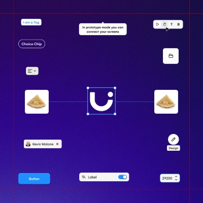
Uizard - AlchemyDesign System | READ →
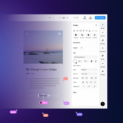
Uizard - Design tool for non designersWeb App | READ →
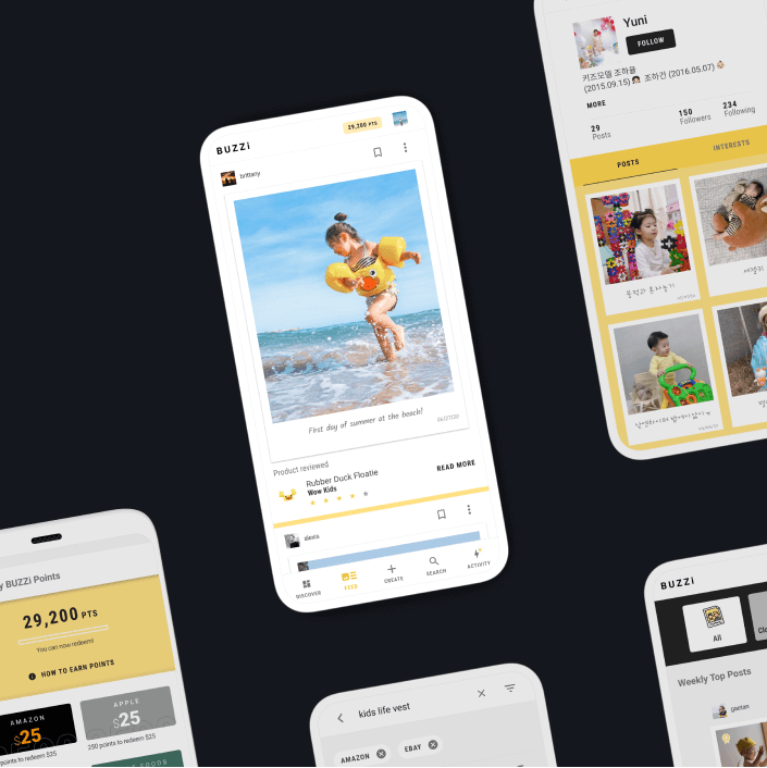
Buzzi - Product review platformMobile App [Android + IOS] | Multi-language | READ →
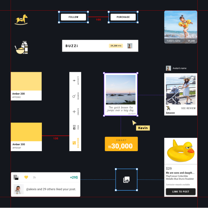
Merch SquareDesign System | READ →
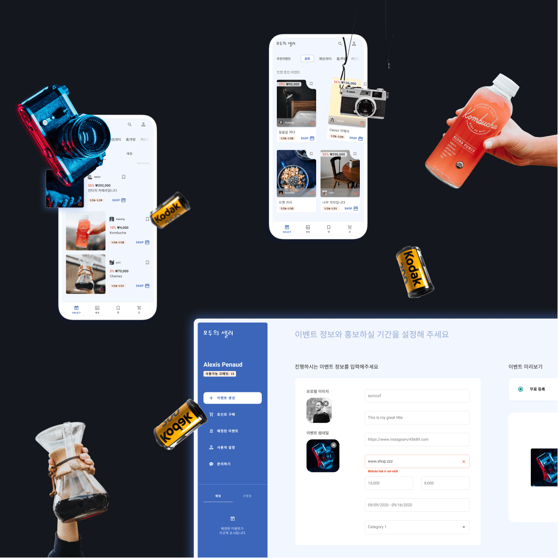
Moduseller - Ecommerce platform for Korean influencersMobile App [Android + IOS] + Dashboard | READ →
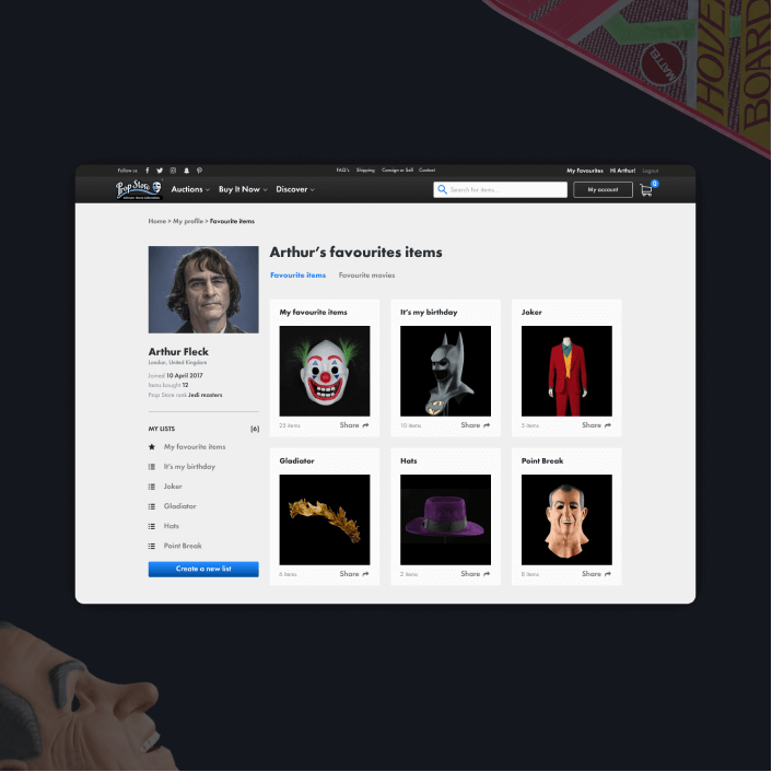
Prop Store - Vendor of original movie propsWeb App | READ →

Want to say Hi? 
hello@kevin-quiec.fr
+33 6 06 41 58 13
Explore my social media


