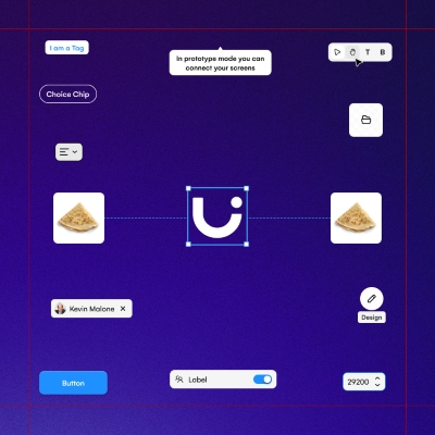
the design system of Uizard
Client
Uizard
Status
Live
Story
3 min read | Written by a human 🧔
Don't scroll!
stage 01
setting the scene
person in charge
Scene 01|01 - context
As a disclaimer, in this case study I will focus on the design system but if you want more context on my experience at Uizard, feel free to read this case study. Also, if you want to know how I built design systems, you can refer to this one.
In November 2021, I was hired at Uizard, a design tool for non-designers. After gaining knowledge of design systems through my career, I was asked to be the person in charge of evolving from a UI kit to a full-grown design system.
stage 02
rising action
the beehive
Scene 01|02 - the audience
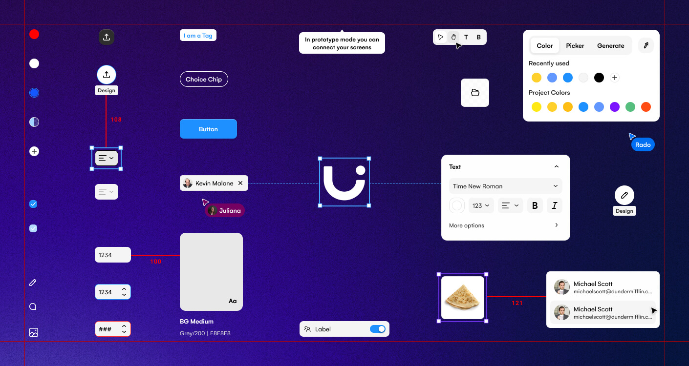
This design system has been made to help our design team while offering our developers a source of truth. As additional visitors, we also had our template designers take inspiration on it to build their components in Uizard and the marketing team to take out components for their marketing assets.
Scene 02|02 - the challenge
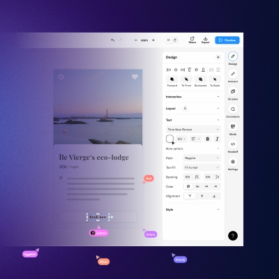
Setting up a new design system on Figma with a branding in evolution while playing with light and dark mode and dividing product designers down the road into squads give us our share of difficulties ^^
stage 03
climax
upcoming flood
Scene 01|03 - unifying
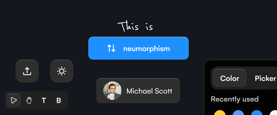
This Serie A meant a couple of changes at Uizard; in addition to growing the team, the brand evolved, the design software changed and a design system came into existence. With the new branding came neumorphism, a visually appealing trendy design style, which will also bring its share of challenges…
Scene 02|03 - moving to squads
Before our move to cross-functional teams, designers worked together as a team and the design system was running fairly well. Being the main contributor, I was able to have an overview of all features and push the needed components. Complexity came when we were divided into 3 different squads. With limited knowledge, it would be difficult for my colleagues to feed the design system while keeping it clean and making sure to not duplicate components. How should we then operate?

Scene 03|03 - one update to rule them all
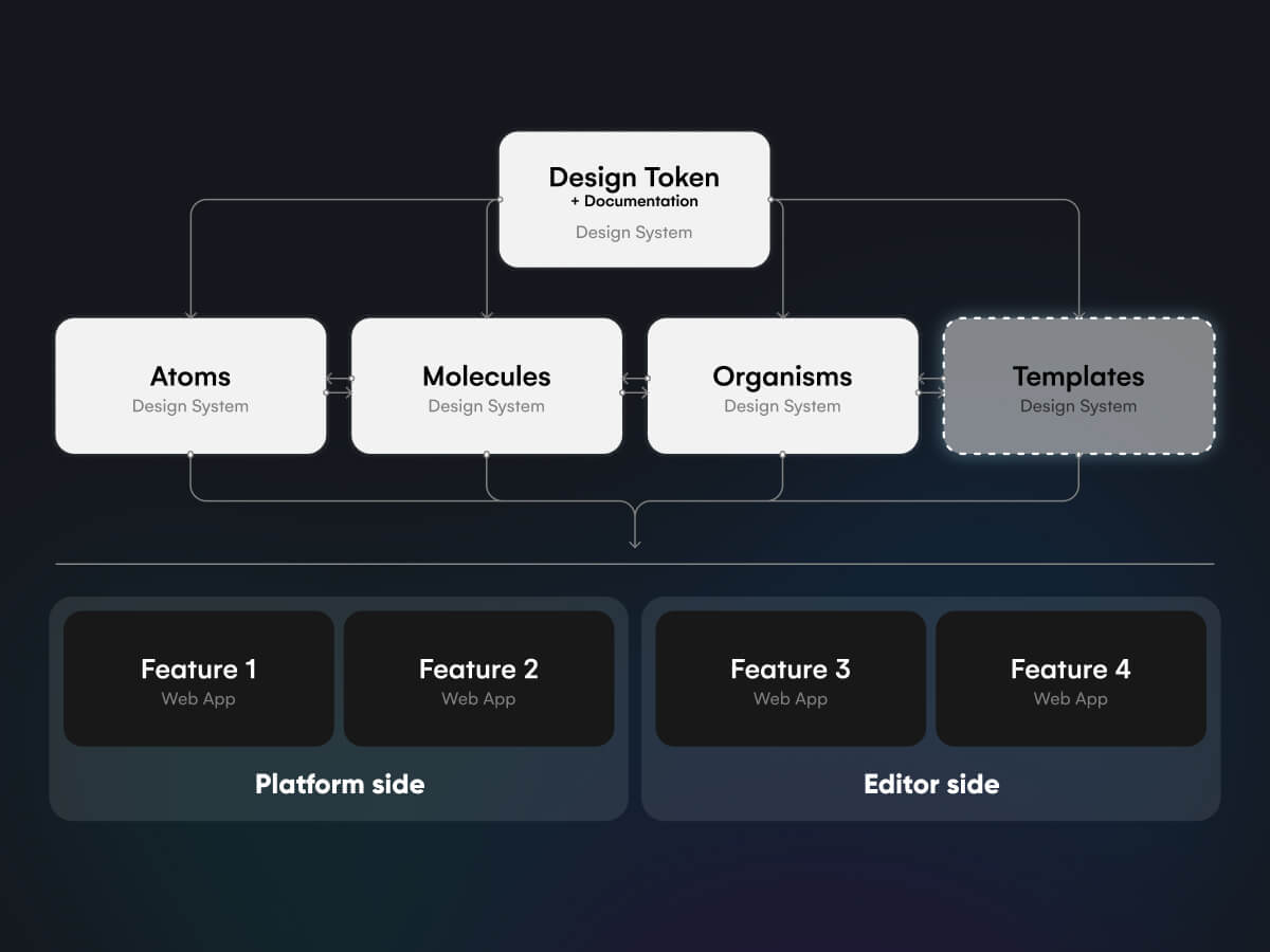
With the product expanding, the features splitting, the light & dark mode extending and the prototype page growing, keeping everything up to date became a challenge. While the atoms / molecules / organisms were doing their job well, more advanced practices would have to be created to avoid being overflowed but which ones?
stage 04
solving the problem
controlling the flood
Scene 01|03 - unifying
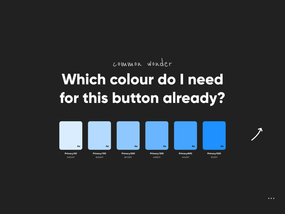
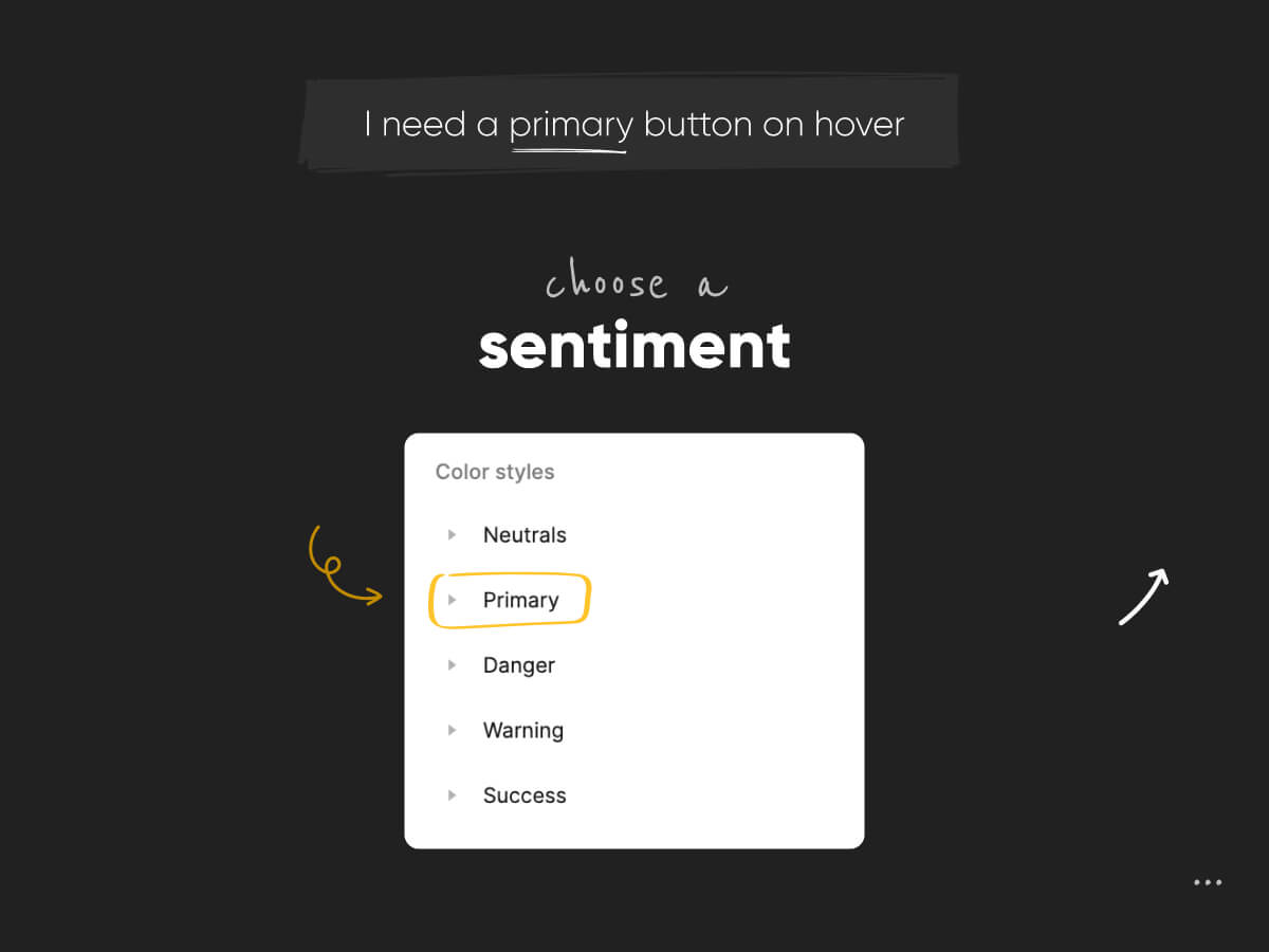
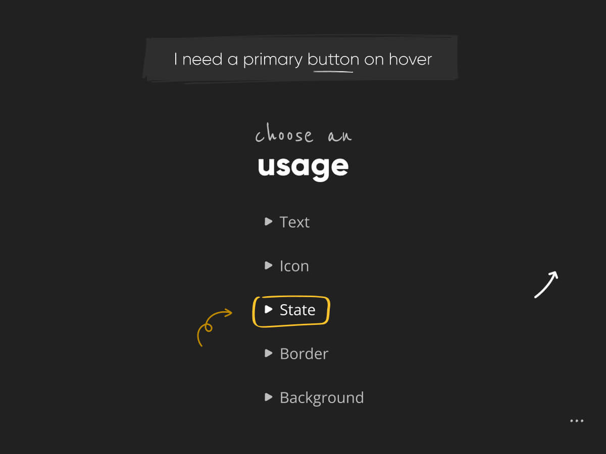
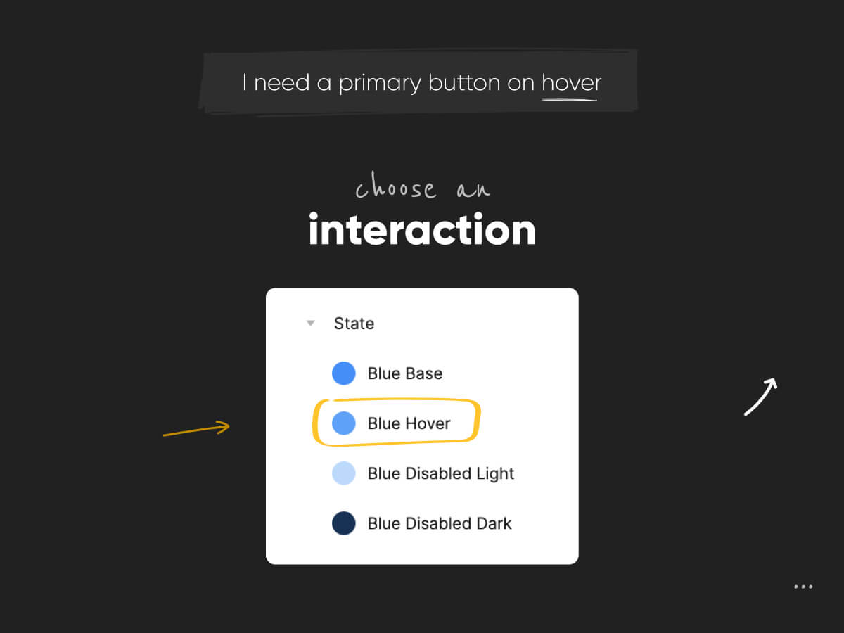
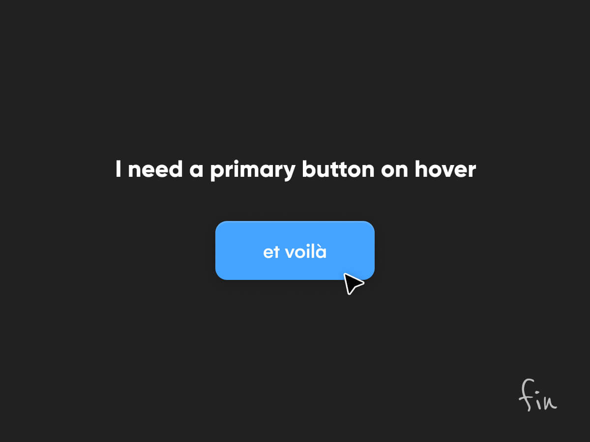
A conference from Asana on their design system changed my way of working. Inspired by their naming convention, it helped me create healthy foundations in our tokens and helped our team maintain the consistency needed. Neumorphism requires more shades, we would have to create a non-uniform light and dark mode (In code, Grey 100 in dark will not equal Grey 900 in light mode anymore) to properly operate. Thankfully, with this naming convention leveraging the usage (Neutrals/Light/Text/Text Default) of each colour, it was more straightforward. Still, HEX code and colour shades lived in the comments of our tokens.
Scene 02|03 - moving to squads
Once we 3 product designers moved to cross-functional teams, we decided that I would remain the one driving the design system. The team could require an update or even work on a component but in the end, I will be the one reviewing it. Thankfully, our design system being quite solid, we could leverage it as much as possible rather than creating new components. If something new had to be created, I would communicate it on our Slack channel (including designers and tech lead) through a message or even a loom video.
Scene 03|03 - one update to rule them all
Splitting features into individual Figma files was a good solution for us but it got tougher and tougher to maintain over time. Therefore, before being overflowed, I decided to create the “Template” file including our fully designed editor / preview / dashboard / sidebar…meaning that updates will need to happen in the design system to maintain up to date all the files they were at.
stage 05
(re)solution
healthy foundations
Scene 01|01 - not reinventing the wheel
It’s hard to quantify a design system with numbers but with healthy foundations, good documentation, and a “playground” to show how components work, it can take you a long way and help the design team save a lot of time.
At this stage, without it, it would have been impossible to deliver that much with only 2 to 3 designers and even more with our software transition from Figma to Uizard, components created are fully in use as now the company is mainly leveraging the blocks we have been building for more than 2 years. Our software switch and job transition would not have been possible without these foundations. Learn more about this transition in this case study.
Thank you for reading
extra
details & links
Date
2021 + 2022 + 2023
Team
- 3 product designers
- 6 developers in average per designer
- 1 project manager per squad
My responsibilities
🖥️ Web App
🧮 Design system
selected works
Uizard - AlchemyDesign System | READ →
Uizard - Design tool for non designersWeb App | READ →
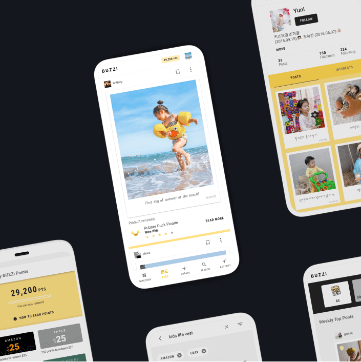
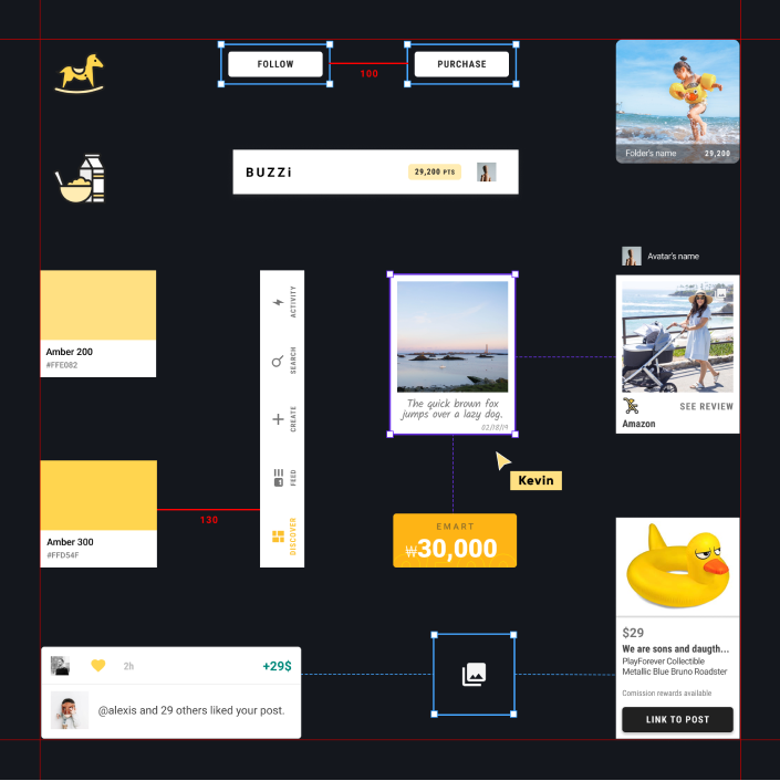
Buzzi - Product review platformMobile App [Android + IOS] | Multi-language | READ →
Merch SquareDesign System | READ →
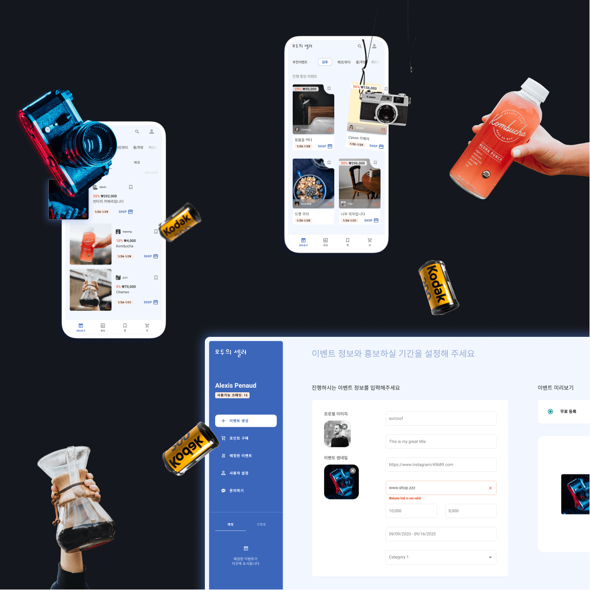
Moduseller - Ecommerce platform for Korean influencersMobile App [Android + IOS] + Dashboard | READ →
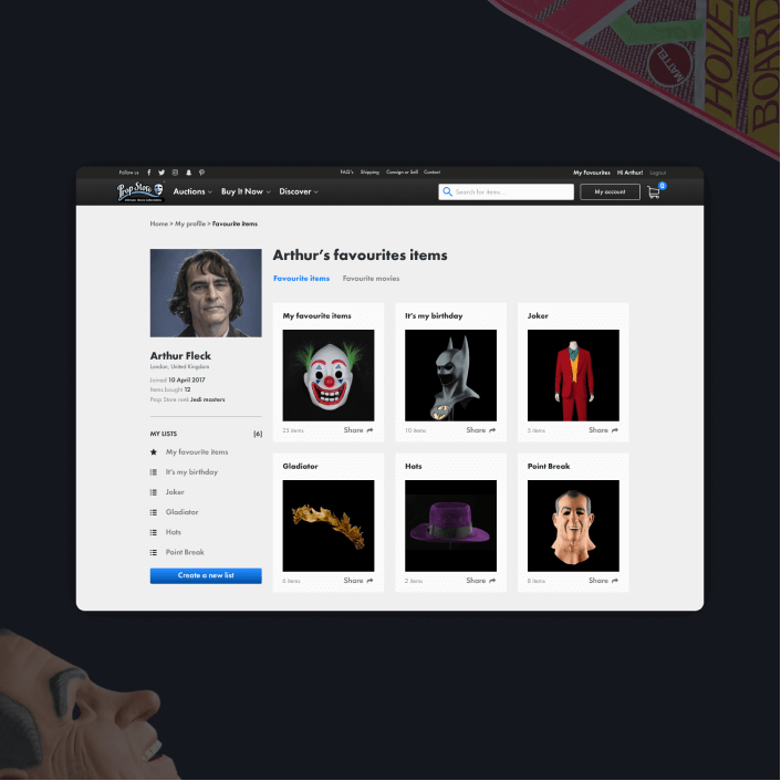
Prop Store - Vendor of original movie propsWeb App | READ →


Want to say Hi? 
hello@kevin-quiec.fr
Explore my social media