Korean influencers platform
Client
Moduseller
Status
Launched | Bankruptcy after 2y
Story
7 min read | Written by a human 🧔
Don't scroll!
stage 01
setting the scene
cannibalism
Scene 01|02 - context
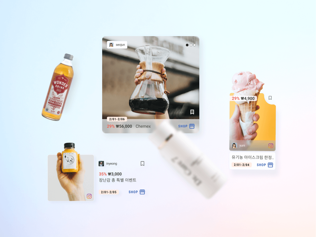
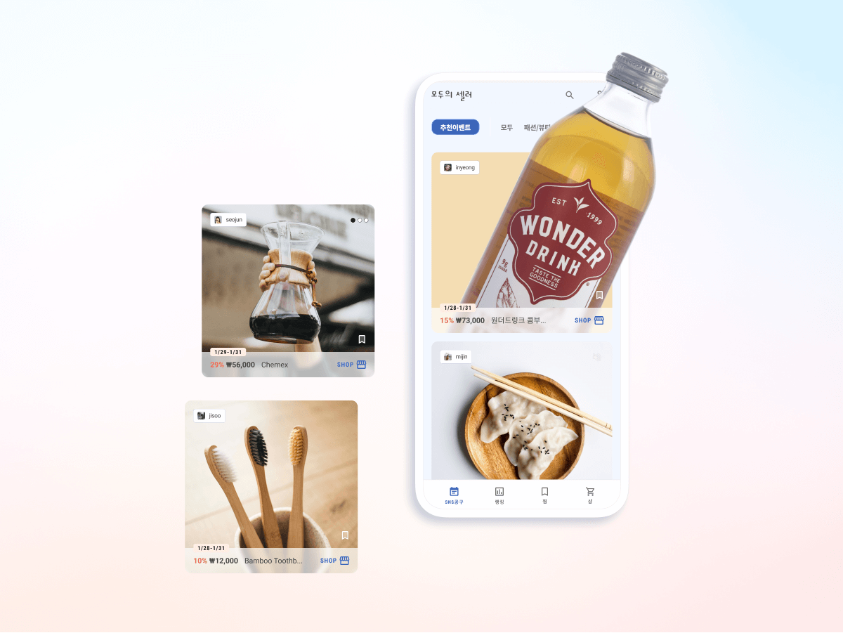
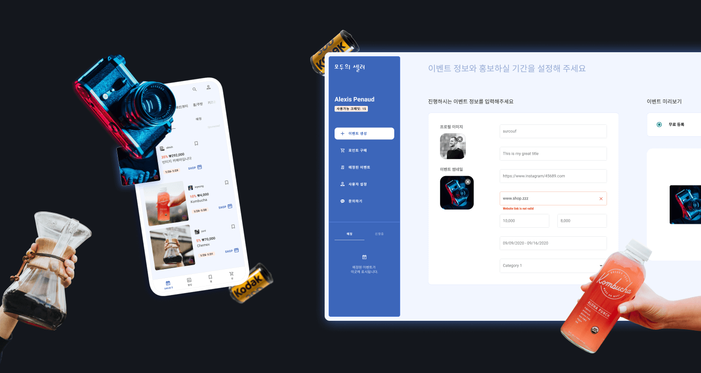
Moduseller was born after a successful feature launch on our first mobile app, Buzzi. In a matter of days, we noticed the numbers growing exponentially and we decided to push this feature into a new app. Buzzi was getting too big and the new feature was cannibalising everything else. Moduseller is a mobile app specially designed to bring the posts of multiple influencers together in one location. Users additionally benefit from a bespoke dashboard to create their very own sales event.
stage 02
rising action
the digital war
Scene 01|04 - business objectives
- Grow our following
- Encourage influencers to pay for sponsored events
- Sell products from our partners
Scene 02|04 - design problem
In this digital war for attention, how does one create a user-friendly platform capable of collecting and organising products sold by influencers?
Scene 03|04 - the audience
We are targeting 3 core groups. First and foremost, the “normal” consumer, browsing with the potential to purchase products.
Secondly, the entrepreneur, seeking a platform to sell their merchandise, whether a novice or a seasoned influencer.
And finally, brands who are willing to sell their products on the platform or want to connect with influencers on the app.
stage 03
climax
fail early and fast
Scene 01|03 - leveraging the design system
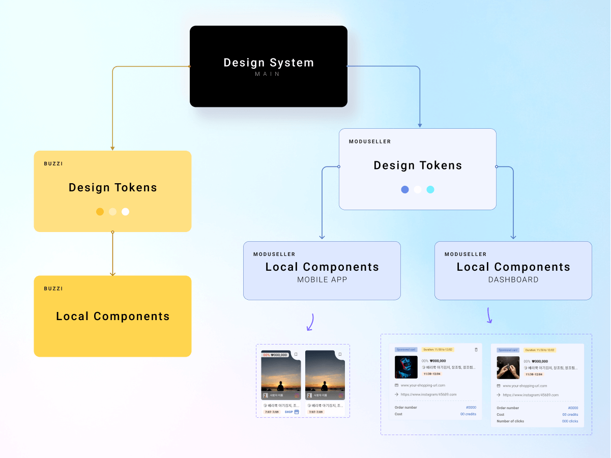
In order to maximise efficiency, I decided to leverage our existing design system. Pre-existing components were put in use for Moduseller and components unique to Moduseller were placed in a sub-system called “local components”. Those components will only be pushed on the main design system should they be required for our two apps.
Scene 02|03 - when is the right time to launch?
When is it good enough to launch? In my opinion, early on. I believe in failing early (if it happens) and improving glad to data and user feedback rather than iterating and not launching. In his book, Ed Catmull, wrote:
“Failure is a manifestation of learning and exploration. If you aren’t experiencing failure, then you are making a far worse mistake. You are being driven by the desire to avoid it”
Asking for feedback around us (family / friends) could have a double-edged sword effect, when there are too many of them and when they are subjective (like colors), it could literally go in every possible direction and slow down any progress.
Choices made are a result of a long process. Designers need to take into account business decisions, technical limitations (based on time and technology), accessibility and many other points.

Scene 03|03 - bringing developers on board
Onboarding junior developers and leading them to develop our dashboard was a challenging task. Over the year 2020, we had 3 rounds of 3 interns staying for 3 months. With a big task ahead of us and being on my own to manage them, I did what I believed would be the best: being transparent, giving them ownership of their features (without overwhelming them), supporting them on the day to day basis, motivating them and keeping their morale high.
My philosophy wasn’t to squeeze all their energy but more to create a win-win situation and listen to their needs and expectations meanwhile being aware of the business side. They were here to learn and on our side we had a workforce working for free.
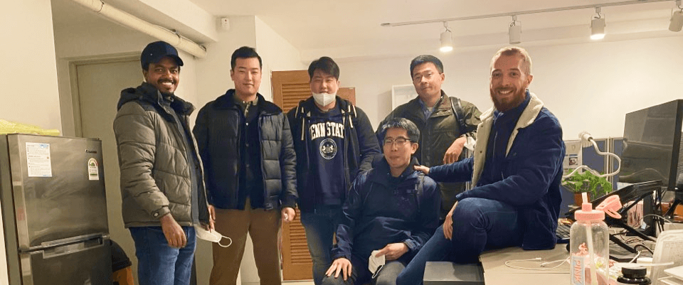
I do hope it went well for all of them and they appreciated their time with me haha. One of the feedback from our interns, James (Just to prove I was not too bad ^^)
Kevin is a designer with excellent leadership and schedule management skills. He is someone who has empathy for others and who is always here to motivate you. More than anything, he's a good person :)
stage 04
solving the problem
a glance of the essentials
Scene 01|02 - events feed
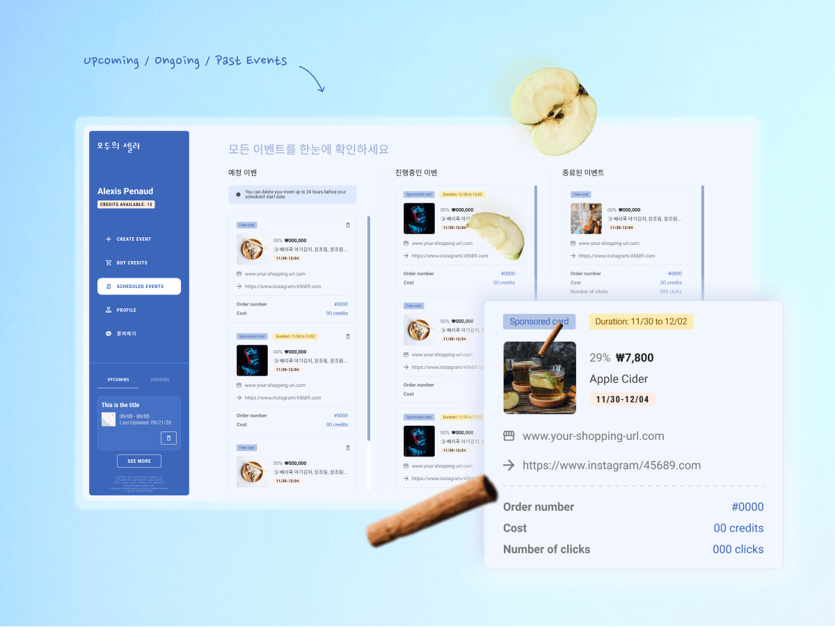
All the sale events created by the influencers are living in the feed. Every user opening our app will land on this feature made of “paid events” and “free events”.
Paid and free events
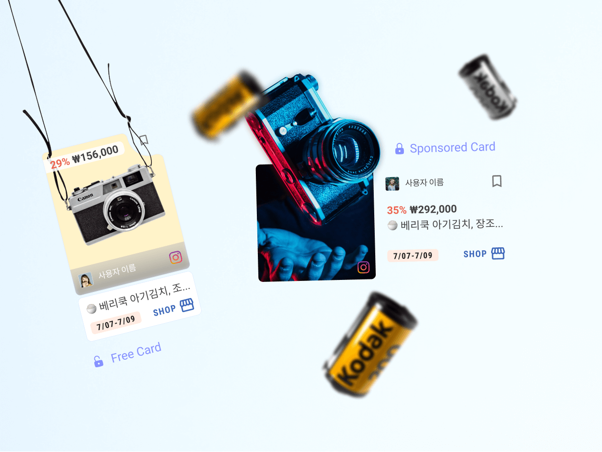
The second part of the feed accessible through the top navigation is made of paid events (cheaper one) and sales events uploaded for free. Every card, either paid or free, has a different design in order to keep them unique and recognisable.
The free card is much more compact. As you can see on the image below, some contained price plus access to their shop and others didn't. In order to grow our community, the events were uploaded at first in-house, however we want to encourage users to use our dashboard in order to create their free (or paid) sale event. Despite the size of the card, the idea is always to keep a strong color contrast and a big enough touch target.
Scene 02|02 - create event (dashboard)
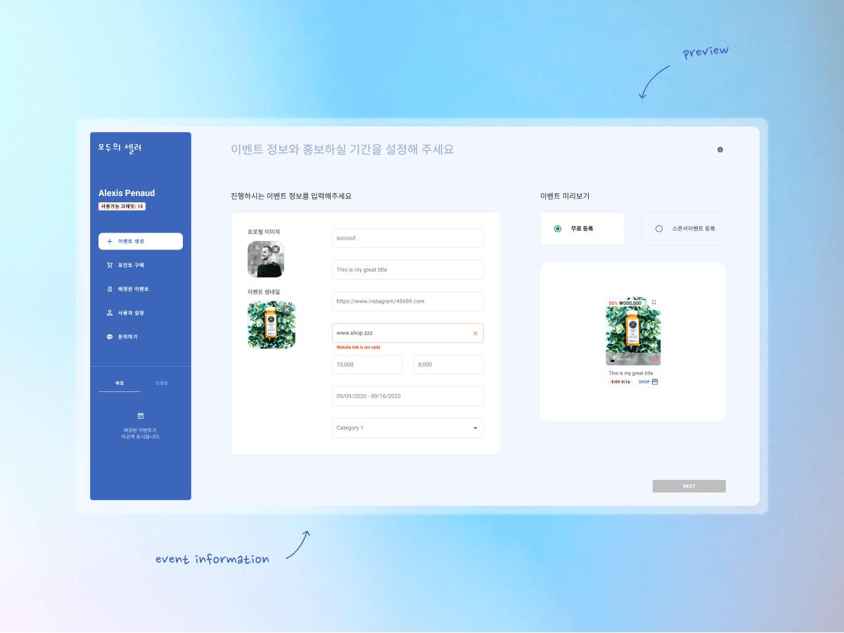
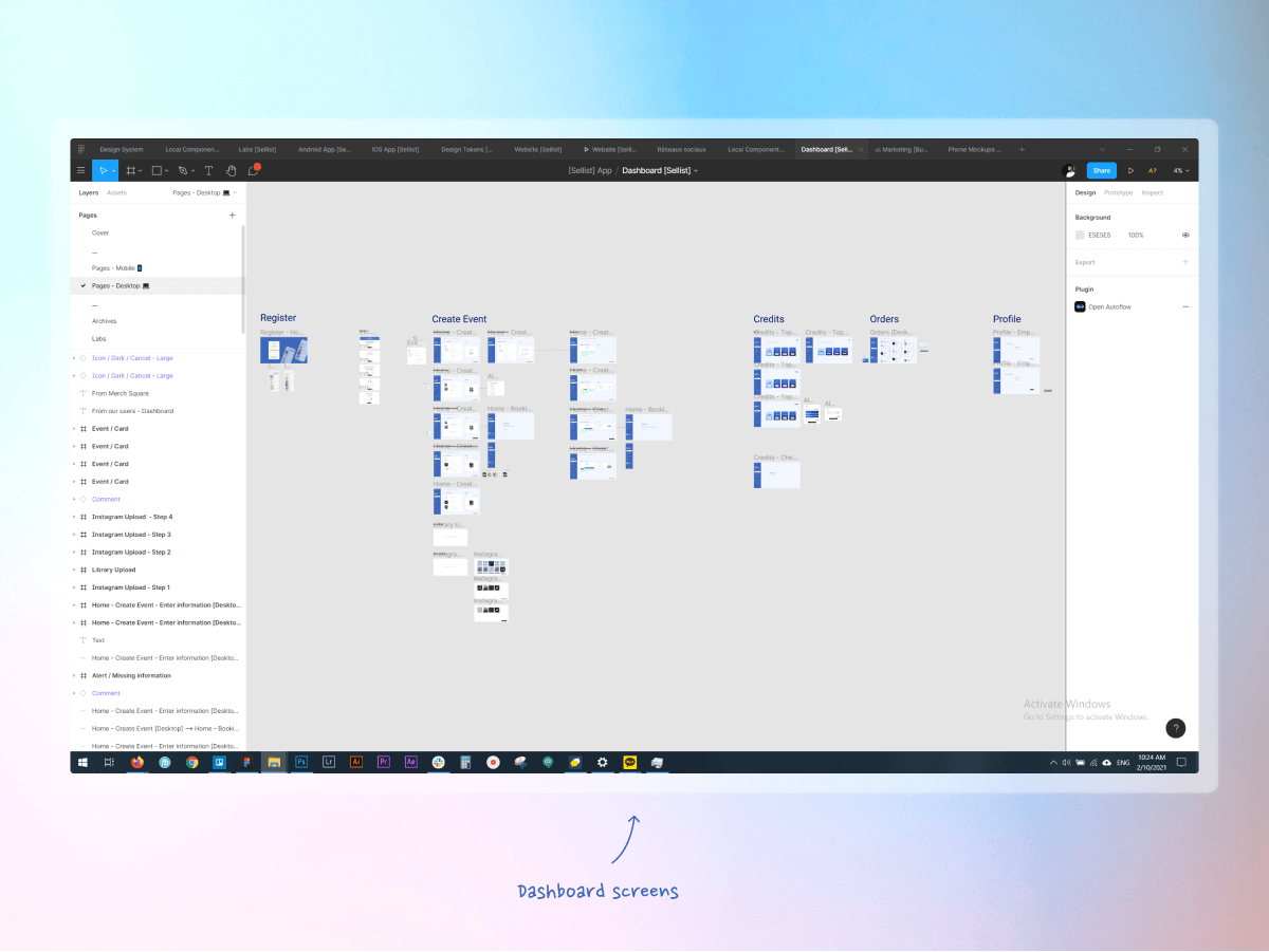
As mentioned earlier, in order for the sellers to upload sale events on the mobile app, they need to use our dashboard created in-house.
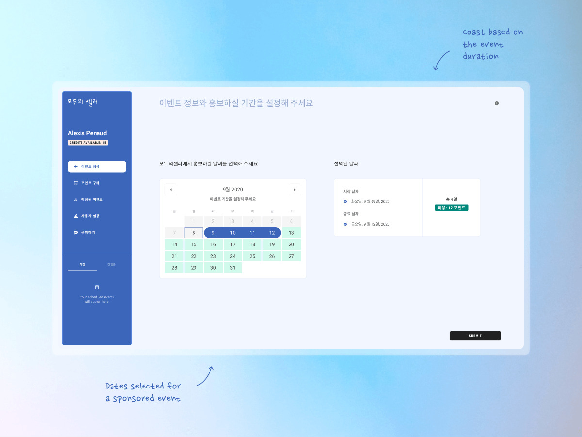
Once logged-in, the user/seller can upload their events by entering information and date related to their sale. To make it clearer, I added a preview on the right side of the screen that shows the content added in real time. You can either pick (and preview) a free event or a paid one. If the user chooses the paid option, he will also need to select the duration of his events.
stage 05
(re)solution
retention and reflection
Scene 01|02 - launching / numbers / retention
With the help of our promotional app, Buzzi, the launch of Moduseller went pretty well for a start, 1000 users downloaded the app in the first month (August 2020). At the time of writing this case study (March 2021), we have reached 15,000 downloads, thanks to social media campaigning and brand partnerships.
Regarding retention, on average and for the latest months (Feb 2021), we managed to retain 1 user in 5, which was good for our business. The part that I’d like to improve in the following months will be to know more of our users and target them more effectively.
Scene 02|02 - what did I learn? reflection
On the technical side, I had the chance to expand the design system and re-use its components in order to onboard the new app faster than the previous one and handle the project as a solo product designer.
For this new app, the time was very sensitive ~ which I understand from the business point of view. However, the strategy set up, in order to produce faster, weakened the dynamic of the team. Rather than entrust the features to the workforce, the flow was split and it created a gap between business owners and the workforce. I feel that I could have communicated more effectively with those above me in order to raise awareness of the team's concerns, and managed the team on the ground better by driving stronger involvement and a more integrated workflow.
We learned from every experience, positive or negative but I learned how much a good dynamic in a team and a fertile environment can make or break the success of a company.
extra
details & links
Date
2020 + 2021
Team
- Lead product designer (myself)
- 9+ developers (including turnover)
- 2 business owners
My responsibilities
📱 Mobile apps (Android app + IOS app)
🖥️ Web app
💻 Website
Unfortunately removed from the internet
selected works
Uizard - AlchemyDesign System | READ →
Uizard - Design tool for non designersWeb App | READ →
Buzzi - Product review platformMobile App [Android + IOS] | Multi-language | READ →
Merch SquareDesign System | READ →
Moduseller - Ecommerce platform for Korean influencersMobile App [Android + IOS] + Dashboard | READ →
Prop Store - Vendor of original movie propsWeb App | READ →

Want to say Hi? 
hello@kevin-quiec.fr
+33 6 06 41 58 13
Explore my social media
