product review platform
Client
Buzzi
Status
Launched | Bankruptcy after 2y
Story
8 min read | Written by a human
Don't scroll!
stage 01
setting the scene
a new start
Scene 01|02 - context
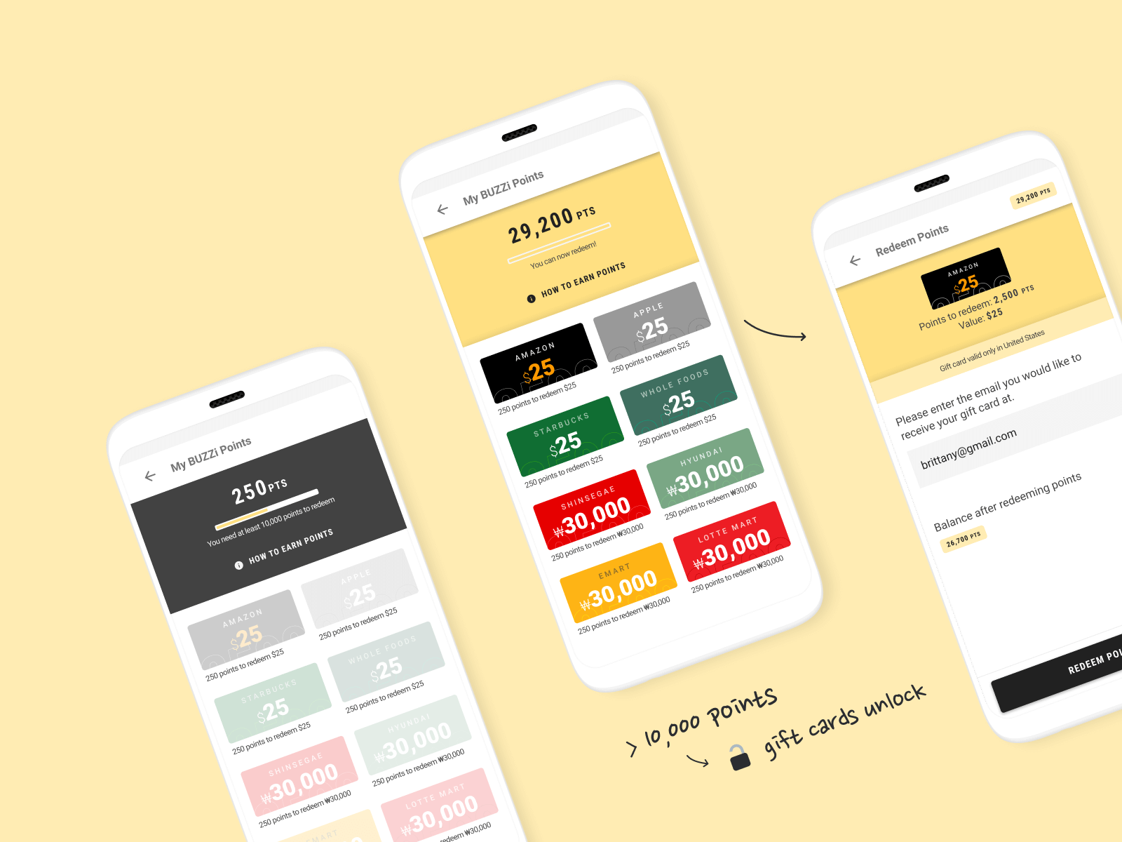
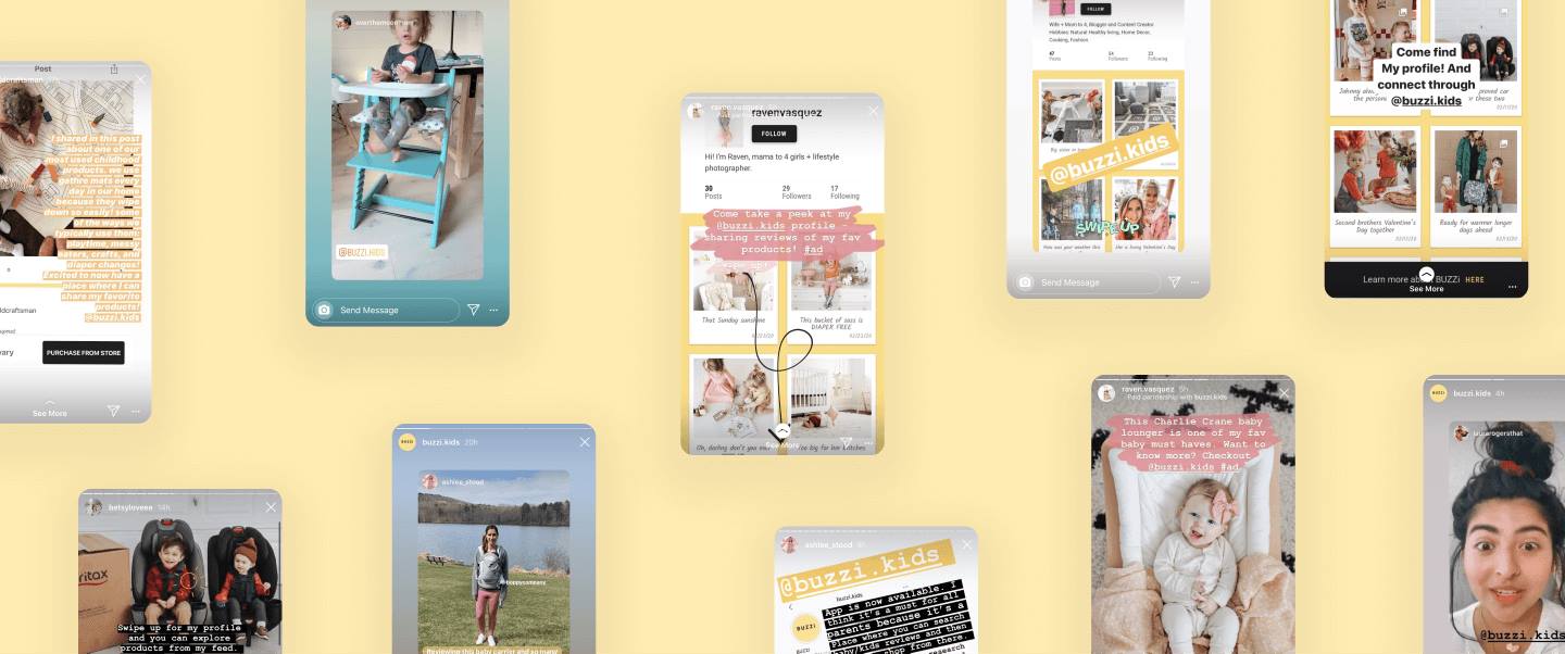
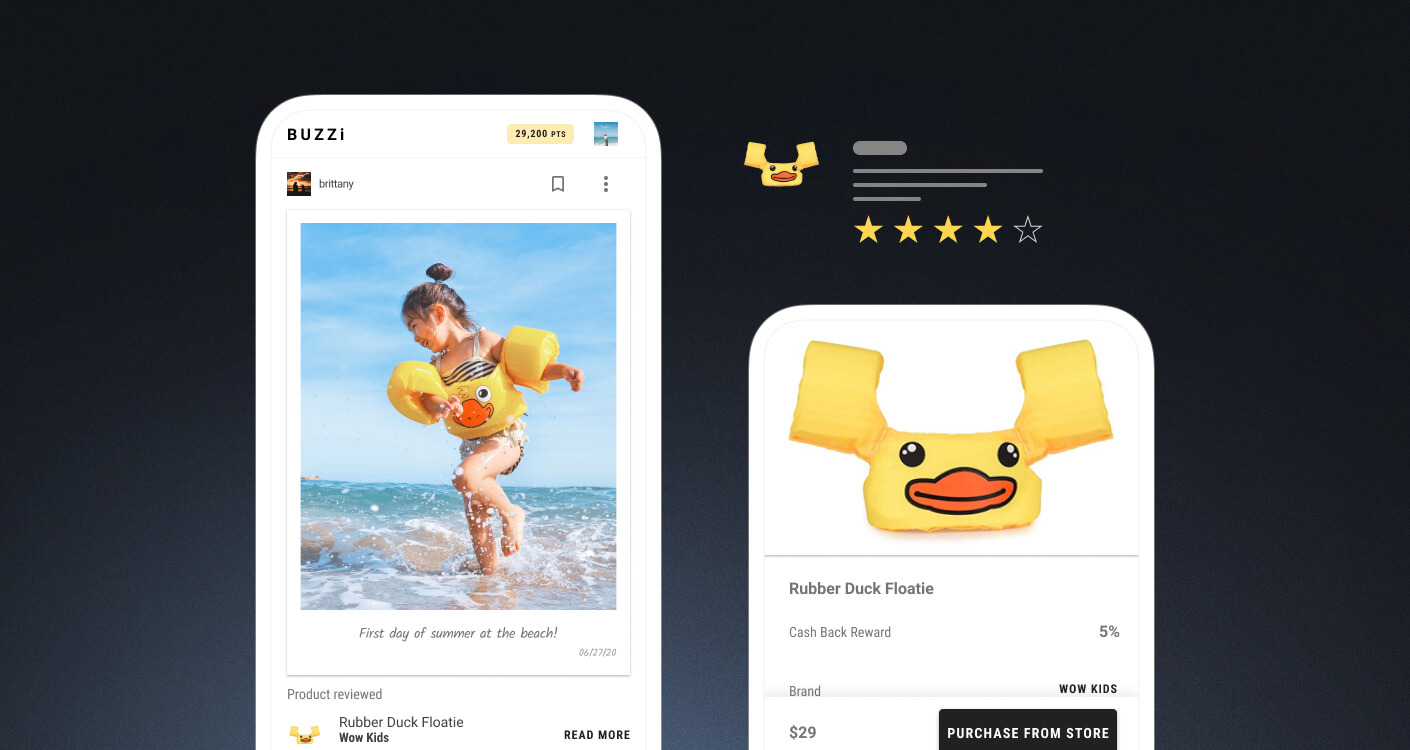
On the first day joining the company, the business owners explained to us in depth their new idea and strategy. The app will be focused on reviewing products and will leverage the blockchain technology to reward our active users who write reviews and interact with the app.
Scene 02|02 - my role
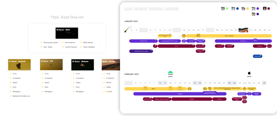
Since the outset of the project in February 2019, my role has been to lead the design of all the digital platforms related to Buzzi (Mobile Apps, Web Apps, Websites...) and manage the roadmaps and planning of the team.
stage 02
rising action
the difficult balance between social and e-commerce
Scene 01|04 - business objectives
- Turn the idea into a profitable business
- Create a community of qualitative reviewers
Scene 02|04 - our early pitch
Like mentioned in the context, we started by leveraging a blockchain community called Steem. While building the MVP, I had convinced my managers to narrow our niche first and specialise into a specific category. My managers being parents, we started researching kids products and found out that the niche was not so crowded. Buzzi Kids was born.
Scene 03|04 - design problem
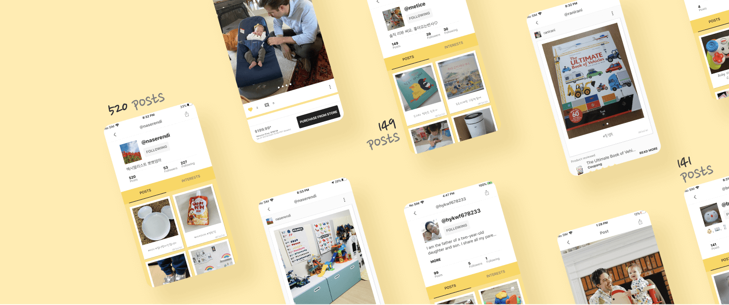
How to encourage people to interact socially with our app by creating and curating content, meanwhile keeping the e-commerce aspect?
Scene 04|04 - challenge
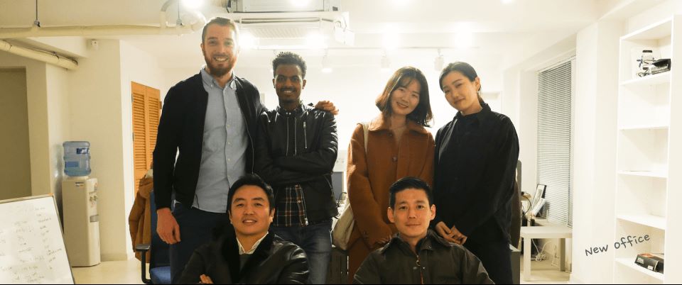
Our managers hired us (Hagos (Android developer) and me) right after the approval of their investors for their new business idea. Their idea being still in iteration phase, the challenge was to unify the “fresh blood” (us) with their full-stack developer (Soyeong) behind this new project. Creating a new team, a new product and a profitable project simultaneously while speaking 2 languages (English and Korean) ^^.
stage 03
climax
finding our identity, reshaping my process
Scene 02|03 - wireframes
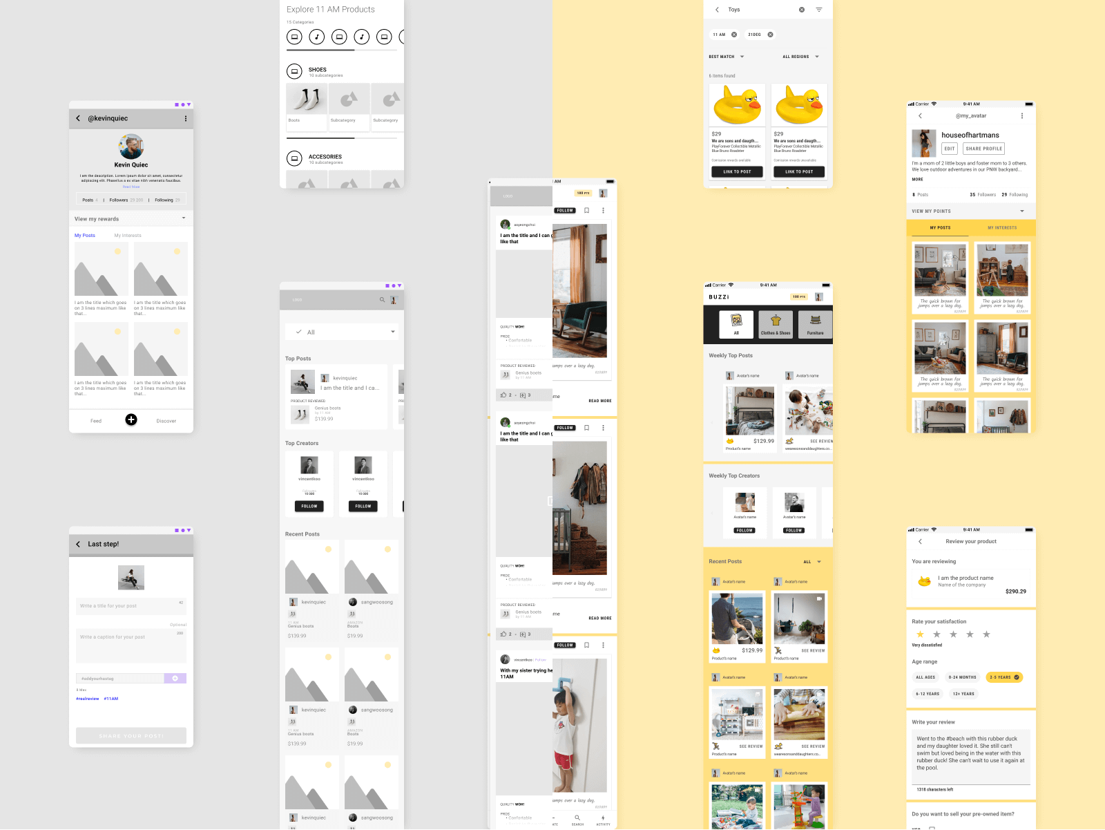
As mentioned above, I started to work on the app by creating wireframes. My goal was to really focus on the UX. Everyone in the team was impatient to see the UI, but it was a good way for them to remain focused on the skeleton of the app. I also used usability testing to get feedback and re-adjust early on the UX.
Scene 03|03 - an evolving process
My workflow is always evolving. In the other case studies of my portfolio, I went deeply into the process; on this one, I wanted to focused more on the points I improved and helped me the most.
Prototyping
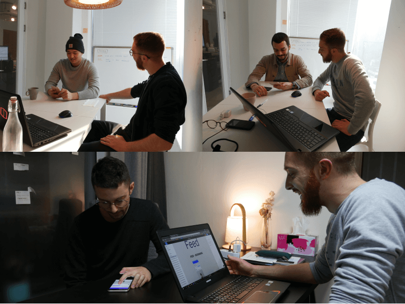
Prototyping really helped me when I was presenting the features. Being a small team, I was trying to use as much as possible a real device and make my colleagues interact with the prototype.
Analysing
Getting user feedback and analysing the data is an important part of my role. To this day (October 2020), we have conducted a few user surveys, and we are checking the data frequently through Apps Flyer and Firebase. More about the numbers at the end of the case study.
stage 04
solving the problem
spotlight on few features
Scene 01|04 - create post
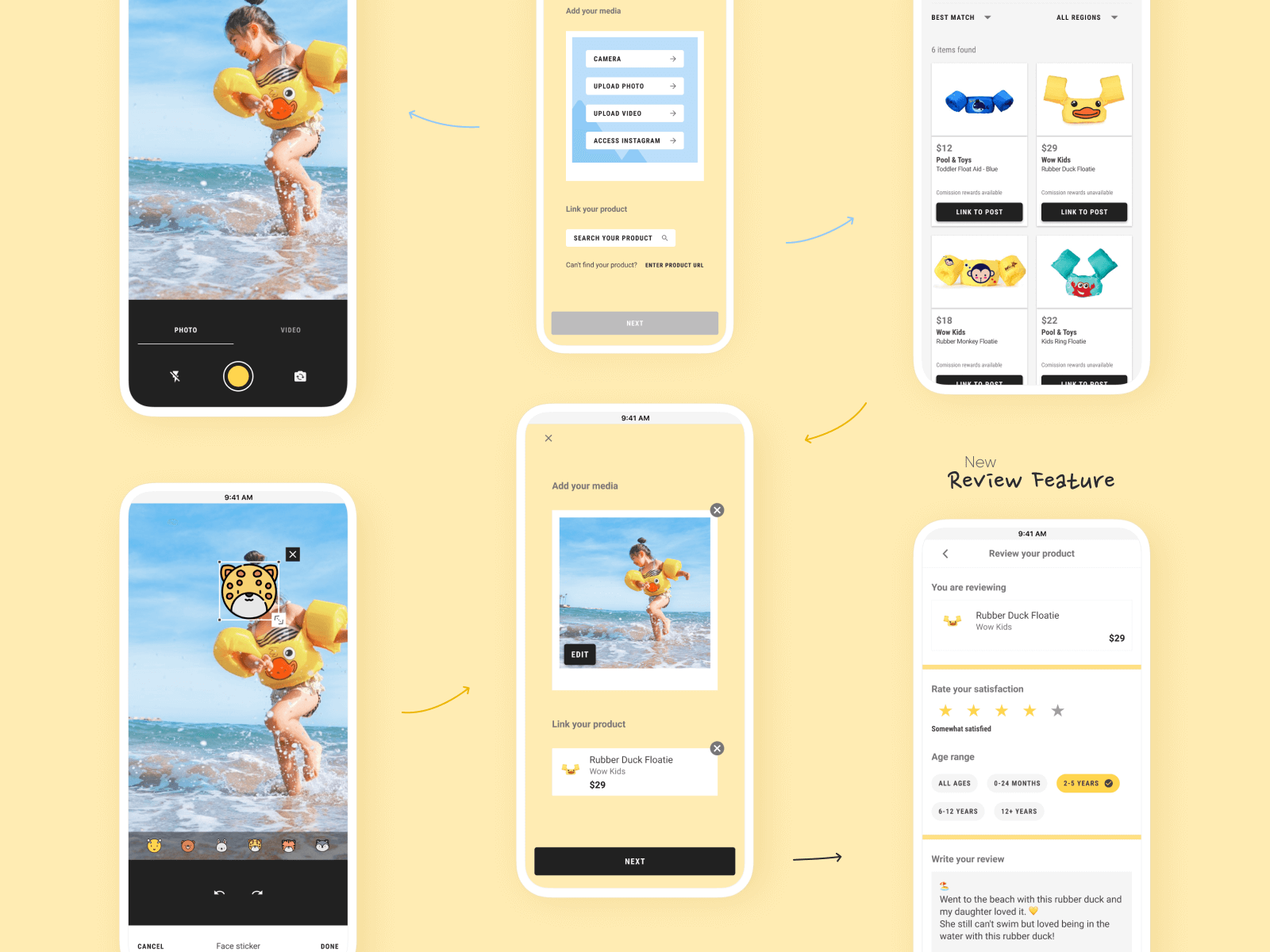
“Create post” is undoubtedly one of the features where we iterate the most.
Is gamifying the experience always the right solution?
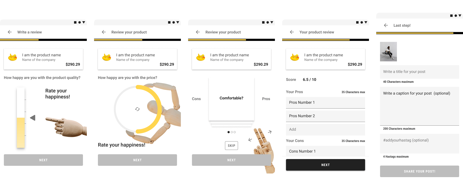
For the first version, the idea was to split the process into steps to show progression. We also wanted something fun to keep users engaged. We tried to leverage the concept of dopamine rush effect and gamify the process to encourage users to go forward.
Testing it multiple times on the real app
After testing the process over and over on our app, we realized that the process wasn’t optimized.
Room for improvement
As expected with a digital product, the work is always in progress, so you have always room for improvement. The create process is now much shorter, and we tried to make it as simple as possible. The main takeaway here will be to ship the feature quickly to be able to test it in real and iterate.
Scene 02|04 - feed
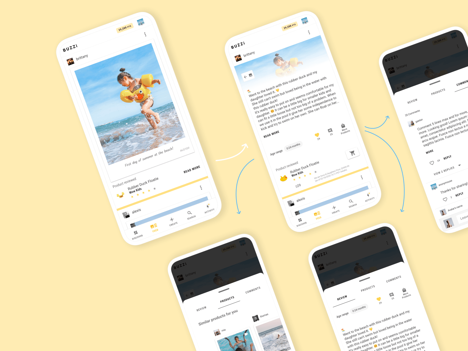
Not instagram, yet
For a long time, the feed was our main page where people land. In mid-2020, we decided to push forward “discover” as the main. Our app is pretty young; users are posting but so far not following much. We have recommended posts in our feed, but once you follow a few people, your feed doesn’t update that fast.
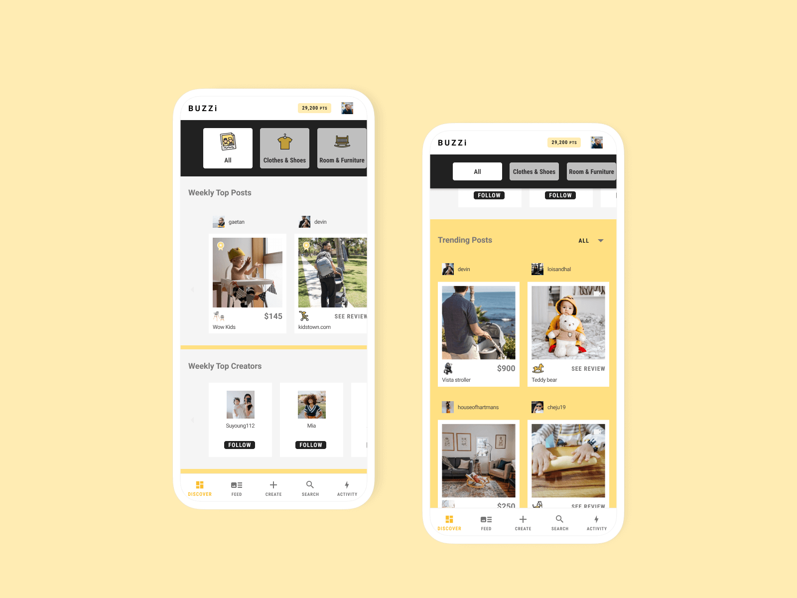
Scene 03|04 - discover
Sharing the pie
We are also using “Discover” to showcase our “weekly top posts” and top users. The reason for these modules is to push people to interact with our app and get some points.
stage 05
(re)solution
launching, iterating, improving, updating
Scene 01|05 - Launching the MVP
My managers’ goal was to leverage the blockchain for the reward, so we went full into the "Steem" blockchain. A bunch of people registered; quantity was great for the start; quality was still not there. Steem ended up not being the best target, so we decided to take a step back for a better public launch.
Scene 02|05 - Launch Android
Android was the first platform that we kicked off with. The launch went well; we received positive feedback. We had bugs of course and room to improve, but the developers did very well.
Scene 03|05 - Launch IOS
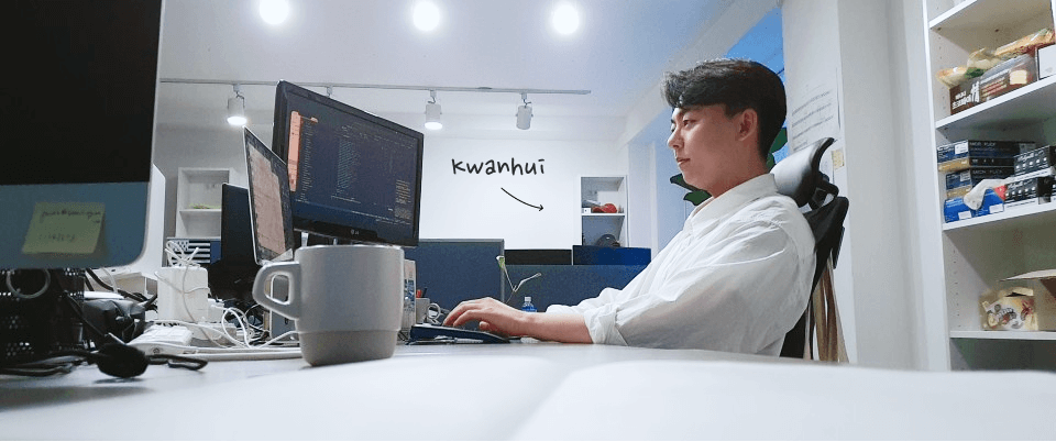
In 2020, we offered a full time position to our talented IOS intern Kwanhui. Our launch started more slowly than Android but was quickly kicked off by the marketing ads.
Scene 04|05 - what I learned as a Lead Product Designer
Product Designer
With this experience, I learned from every aspect of my position. Being in a small company, you don’t limit yourself in a specific role and participate in all phases of a product; this is what I enjoyed.
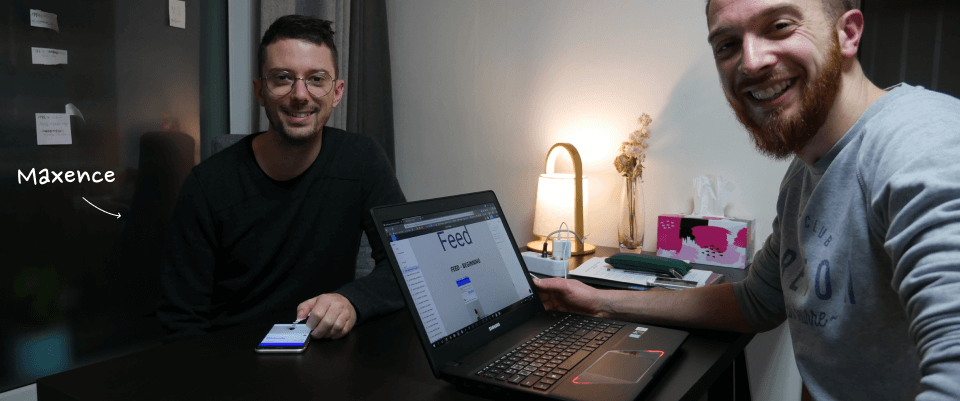
Design system was one of the major challenges for me. I learned a ton online, and also am grateful for the help of my friend Maxence.
Scene 05|05 - our users
Marketing
What I realised with the data we acquired over the months was that marketing on Facebook ads / Google was effective to grow our community of curators. Good for quantity.
extra
details & links
Date
2019 + 2020 + 2021
Team
- Lead product designer (myself)
- 4 developers (including turnover)
- 2 business owners
My responsibilities


Unfortunately removed from the internet
selected works
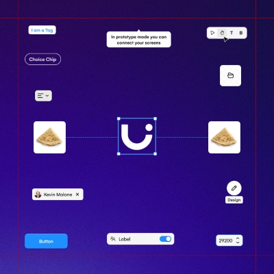
Uizard - AlchemyDesign System | READ →
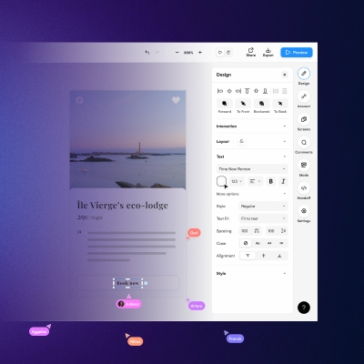
Uizard - Design tool for non designersWeb App | READ →
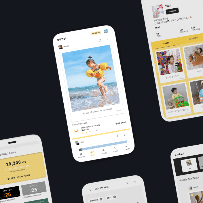
Buzzi - Product review platformMobile App [Android + IOS] | Multi-language | READ →
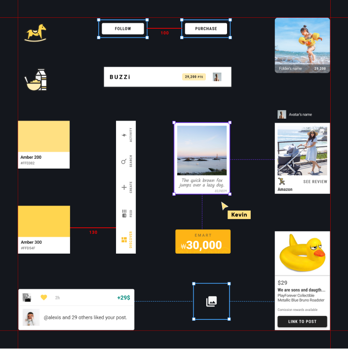
Merch SquareDesign System | READ →
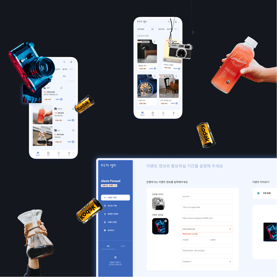
Moduseller - Ecommerce platform for Korean influencersMobile App [Android + IOS] + Dashboard | READ →
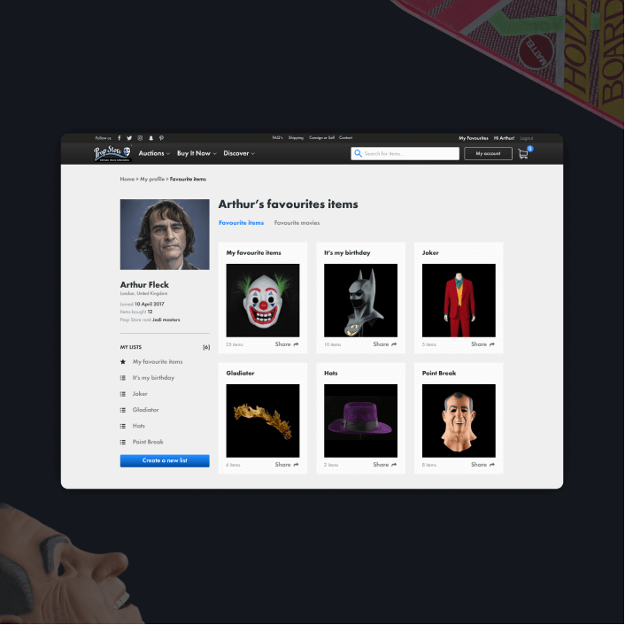
Prop Store - Vendor of original movie propsWeb App | READ →

Want to say Hi? 
hello@kevin-quiec.fr
+33 6 06 41 58 13
Explore my social media


