robotic food kiosk
Client
Roborus
Status
Live | Redesigned
Story
3 min read | Written by a human
Don't scroll!
stage 01
setting the scene
intelligent customer service
scene 01 - context
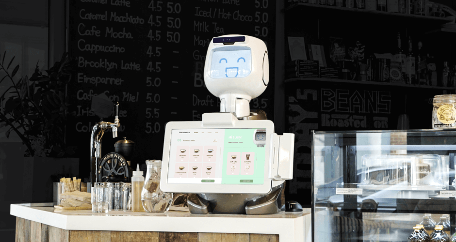
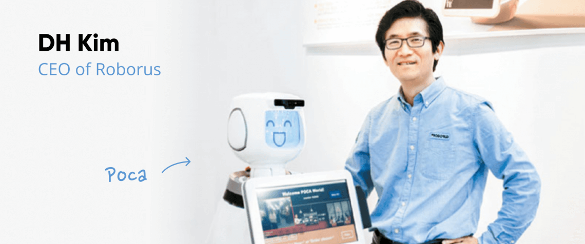
When Roborus came to us, they had developed an ordering kiosk with advanced facial recognition and AI technologies. The product looked great. It functioned well on a technical level, but the interface they’d developed internally didn’t take full advantage of their technology. Planning to pitch their robots to potential investors and clients in the following months, they were in need of a sleek website and a video to show their robot, POCA, in a real environment.
stage 02
rising action
selling an experience
Scene 01|04 - business objectives
- Sell to corporate their robots
- Convince investors to invest in their company
- Increase brand awareness
Scene 02|04 - user needs
A user-friendly interface to make the process easier and faster to order food.
Scene 04|04 - the challenge
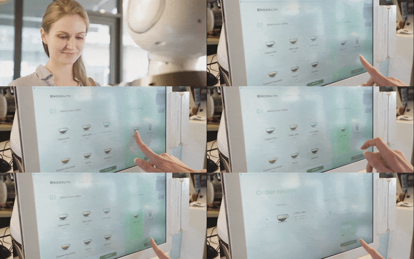
We had a tight deadline as we were not only helping them create a new interface, but also we needed to feature the interface in their upcoming product video. We had to move fast. The video would be filmed in a coffee shop, so we started by created a coffee menu interface.
stage 03
climax
research & exploration
Scene 01|02 - research
With a deadline as tight as this project, I couldn’t dedicate too much time for research. I analyzed a few major kiosk interfaces such as McDonalds or the Starbucks app and started to work on our Beta interface.
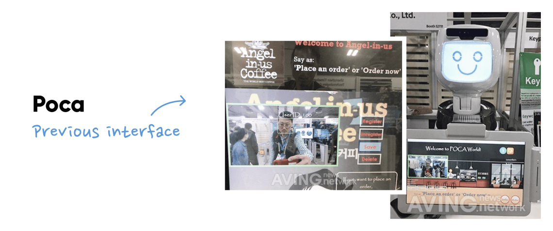
Scene 02|02 - previous interface
identifying pain points
Made by developers, the previous interface needed a complete redesign. The font used, “Papyrus”, was not clear enough, and the user experience was confusing due to the lack of hierarchy of the content and a convoluted layout. The main idea of their robots is to speed up the order and thus improve efficiency for the business. But the existing interface failed to deliver on this main selling point.
stage 04
solving the problem
design
Select your coffee
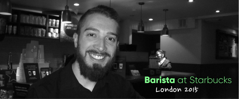
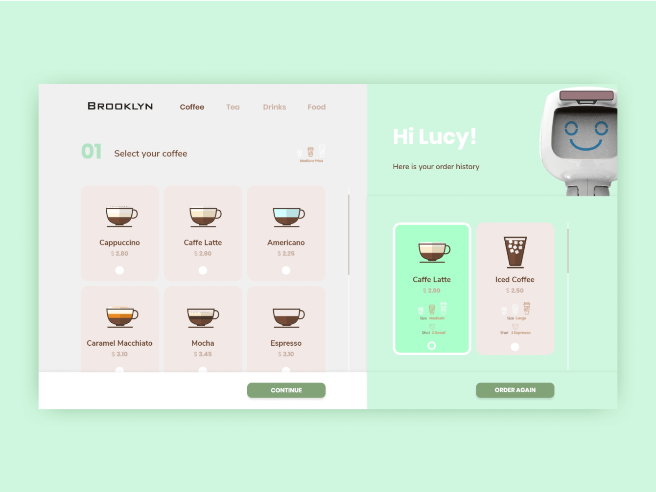
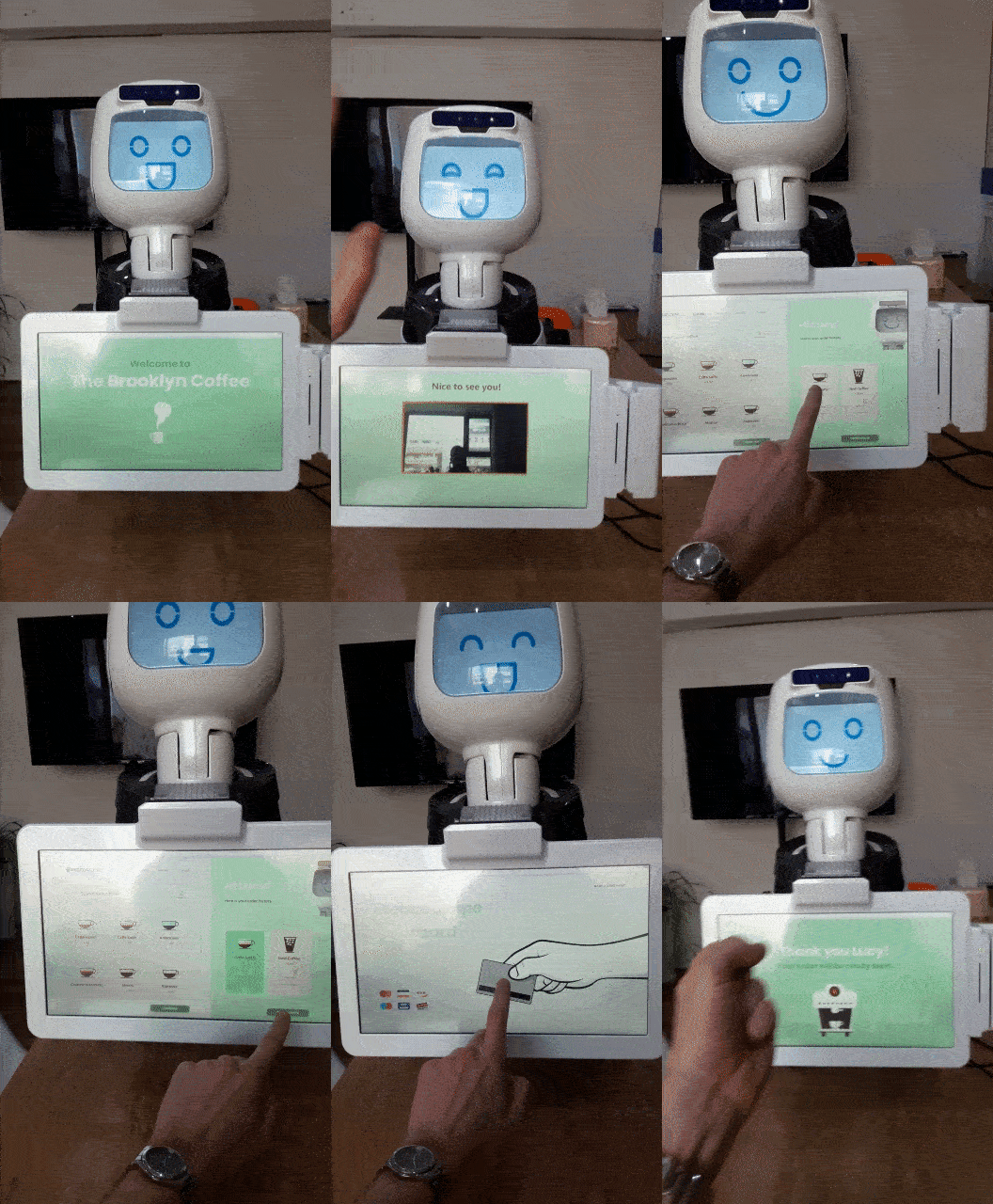
With the number of items à la carte, I decided to split the menu into different tabs. I didn’t forget to add the size of the cup on the top right and placed a list of items with their price and a visible scrolling bar. On the right, as requested by the client, I dedicated a space for the regular customer. Bear in mind that the step before the menu is the facial recognition so that the robot can recognize the customer and show the order history. The main goal is provide a faster ordering process; That’s why I dedicated an important part of the screen for this section. Many of the regular customers that I had in London were always ordering the same drink.
Scene 02|02 - Payment
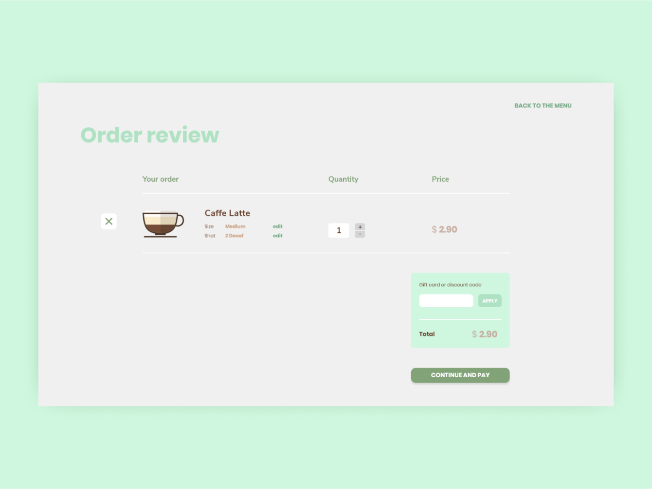
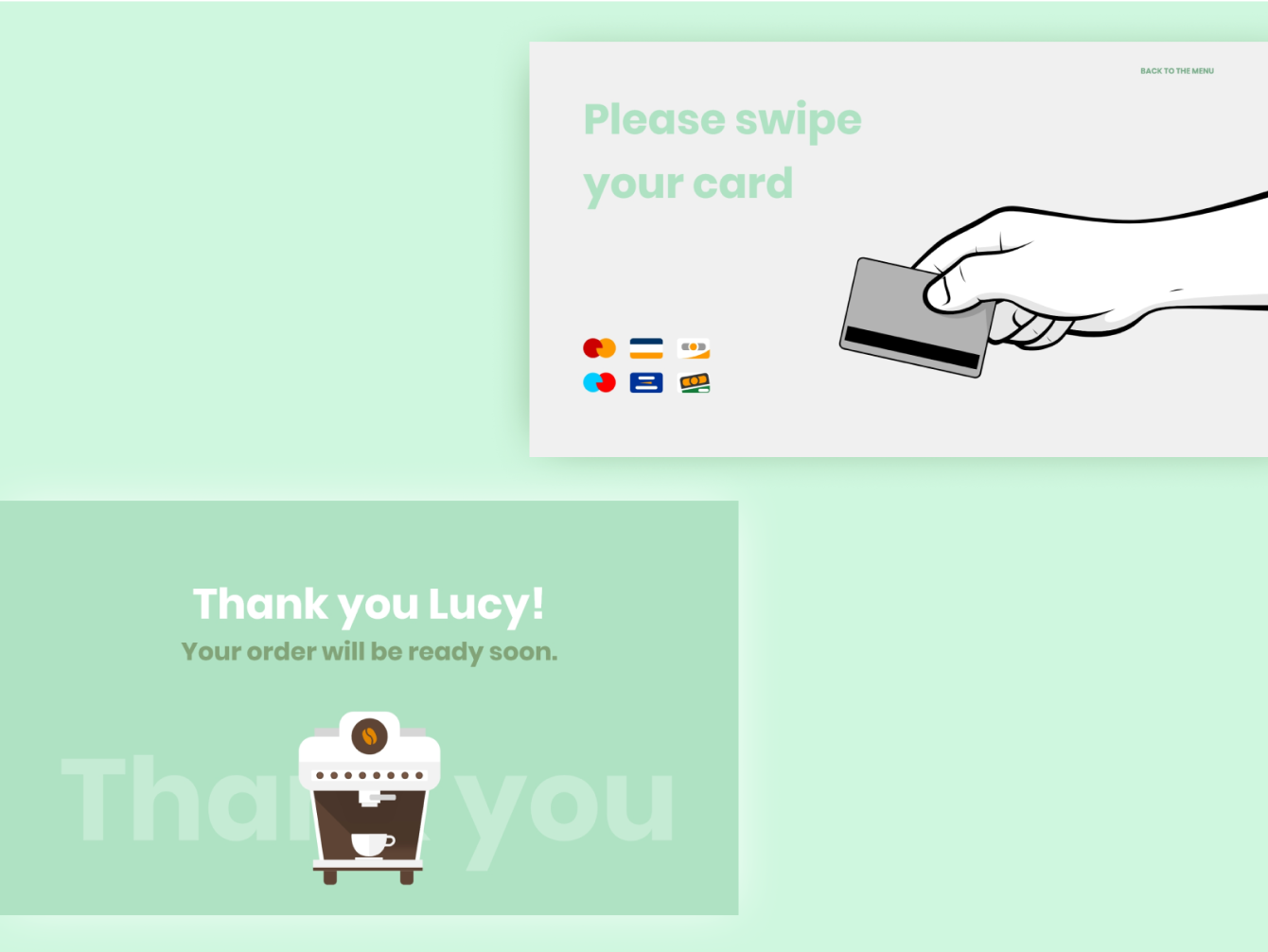
After choosing the item and pressing on the button “continue”, we end up on the order review page. Having personally used such kiosks or even having seen my friends ordering, I noticed that we often make mistakes in our order. So I placed a button where you can edit and change your order. You could also erase your item and go back to the menu easily. As many of coffee shops / fast food restaurants have their own gift cards and discounts, I placed an input button right before the payment page.
stage 05
(re)solution
ending the story... for now
Because of the rush, I went straight from sketches to visual design, skipping a few steps along the way. The interface is still in beta version but will be improved soon with user tests and on site in the US.
In the end, we created a functional interface for both of Roborus’s models in two days. It was ready to be featured in the video and for the client to use during sales presentations in the United States. Glad to our help and support, Roborus were accepted to big accelerators such as "The Farm" in the US and "Techstars" in Germany.
Website
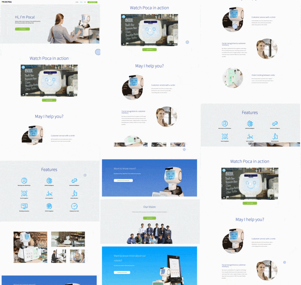
According to the budget and the timeframe, I try to deliver the best work possible. The website is now more clear, simple and easy to understand. The focus is now more on the experience and the advantages that the robots bring to the business owners rather than all the product specifications. The Roborus’s team was very satisfied by the job that we delivered.
Video
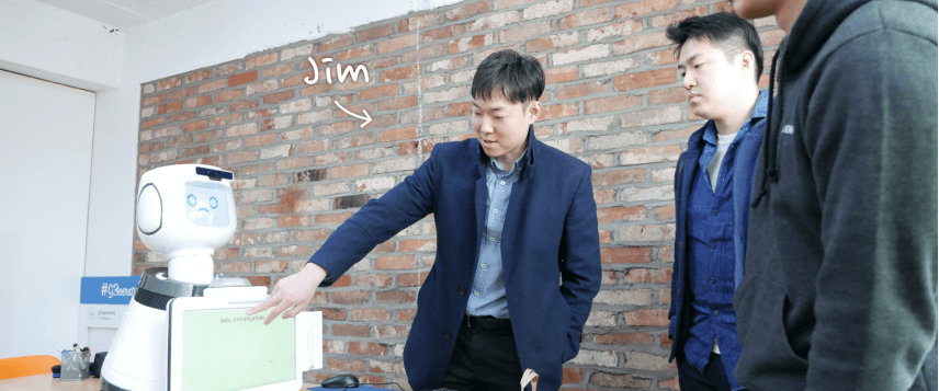
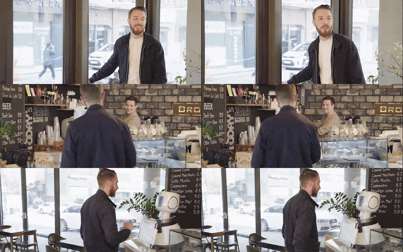
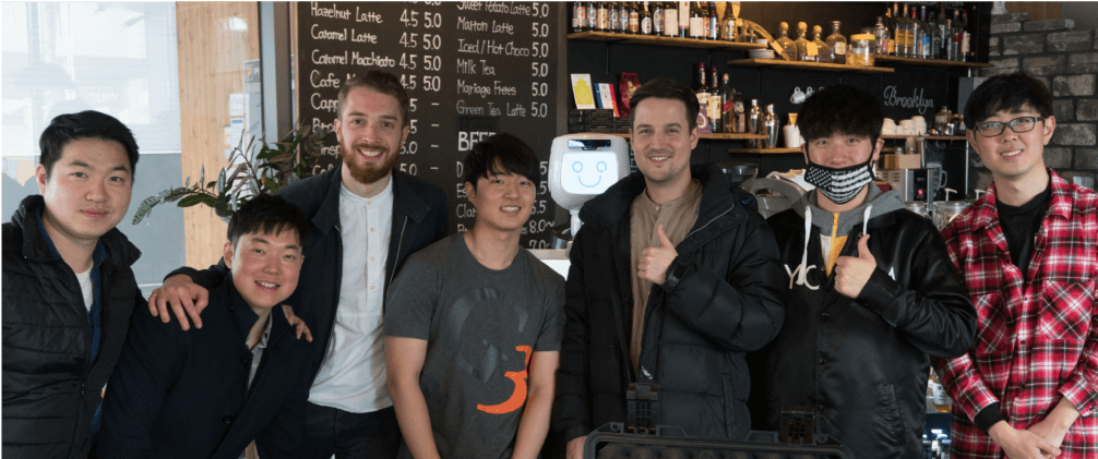
And finally, the Roborus video, made by my friend filmmaker Derek Uhm and where I play a short role in. Please enjoy.
…Still waiting for the Oscar… it will come. It took time for Leonardo Di Caprio too.
extra
details & links
Date
2018
Team
- 1 product designer (myself)
- 1 Project manager
- Roborus team (our client)
My responsibilities


selected works
Uizard - AlchemyDesign System | READ →
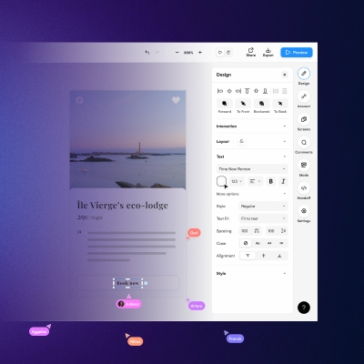
Uizard - Design tool for non designersWeb App | READ →
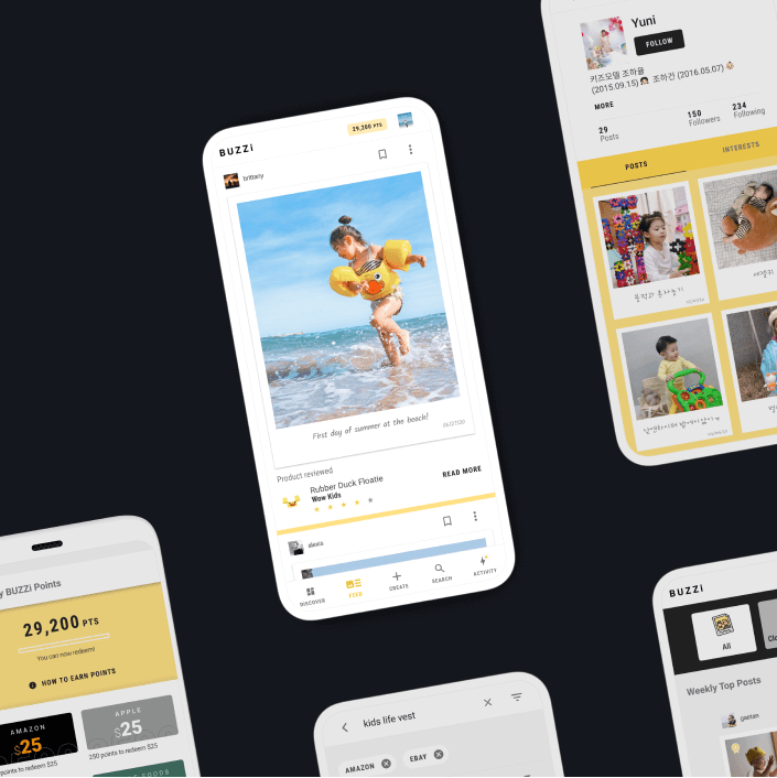
Buzzi - Product review platformMobile App [Android + IOS] | Multi-language | READ →
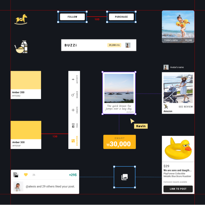
Merch SquareDesign System | READ →
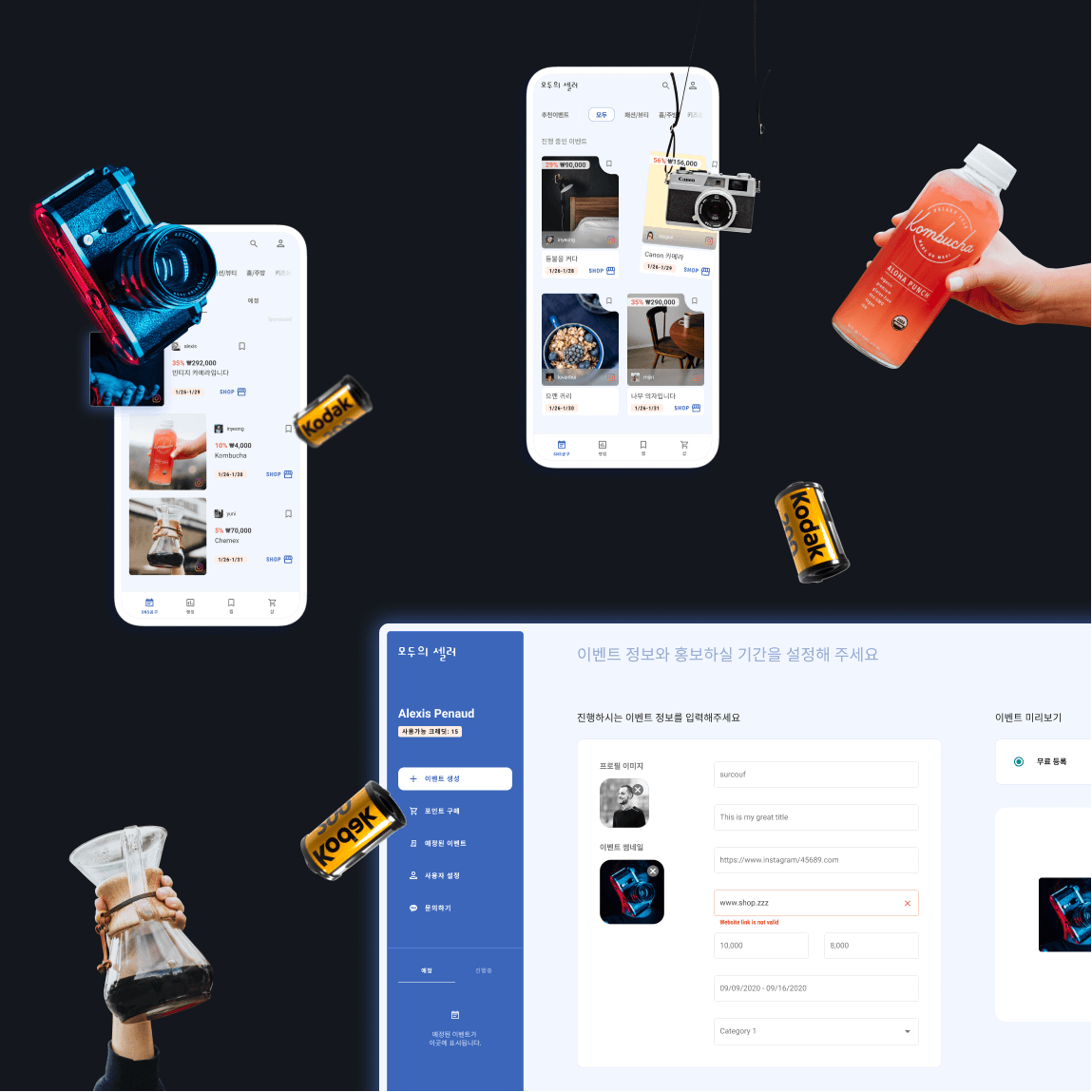
Moduseller - Ecommerce platform for Korean influencersMobile App [Android + IOS] + Dashboard | READ →
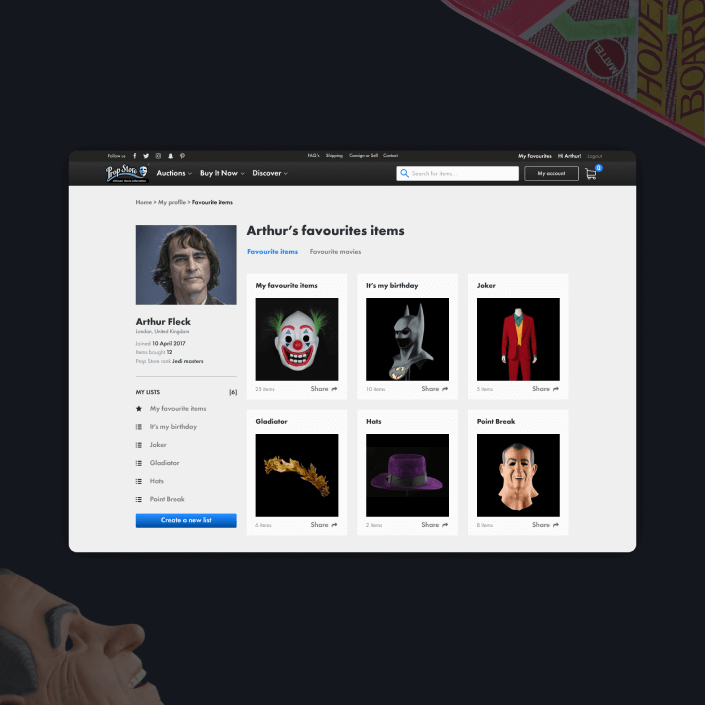
Prop Store - Vendor of original movie propsWeb App | READ →

Want to say Hi? 
hello@kevin-quiec.fr
+33 6 06 41 58 13
Explore my social media
