improving a blockchain app
Client
Sovereign Wallet
Status
Live | Redesigned
Story
3 min read | Written by a human 🧔
Don't scroll!
stage 01
setting the scene
d-20,
before the launch
scene 01 - context
SovereignWallet is run by brilliant engineers, who have created a first-of-its-kind messenger-style cryptocurrency wallet with banking grade security. Like many of the engineering-focused companies, marketing and design came into consideration late in the process. Just 20 days before their first token sale, critical marketing assets such as messaging, website, mobile app design, social media channels, explainer videos and online community were all incomplete, if not nonexistent.

stage 02
rising action
the race to success
Scene 01|05 - business objectives
- Increase the number of registrations
- Increase the participation in the token sale
Scene 02|05 - user needs
A user-friendly mobile wallet that offers intuitive transfer and exchange of cryptocurrency
Scene 03|05 - design problem
The SovereignWallet app offered many helpful features for users, but it was designed from the developers’ point of view. This meant that the app was difficult to navigate for average users. Because the success of SovereignWallet’s business model depended on the network effect of its user base, the app was in need of an overhaul for user friendliness and sleek design.
Scene 04|05 - the challenge
The challenge was to make the process of registration and use of main features easier and quicker for the users, while respecting the rules/law required for a blockchain mobile app.
Scene 05|05 - onboarding experience
The G3 Partners team downloaded and registered to SovereignWallet. We quickly found the experience very difficult - it required too many steps and offered confusing instructions. We offered to rethink and improve the onboarding experience as the first step.
stage 03
climax
research & exploration
Scene 01|03 - research
The goal was to see how other apps solved similar problems and replicate their success. Based on my experience and past research, I selected projects with a intuitive and easy onboarding process.
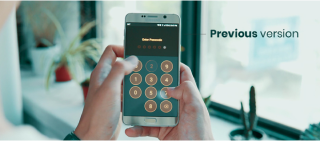
Scene 02|03 - previous app
Identifying pain points
I discovered a couple of problems with the existing onboarding process. It took too many steps to register; the brand identity was inconsistent throughout the process; the inputs were not clearly visible.
Constraints
There was an aim to rethink the entire onboarding but we needed to respect the rules that apply on blockchain mobile app.
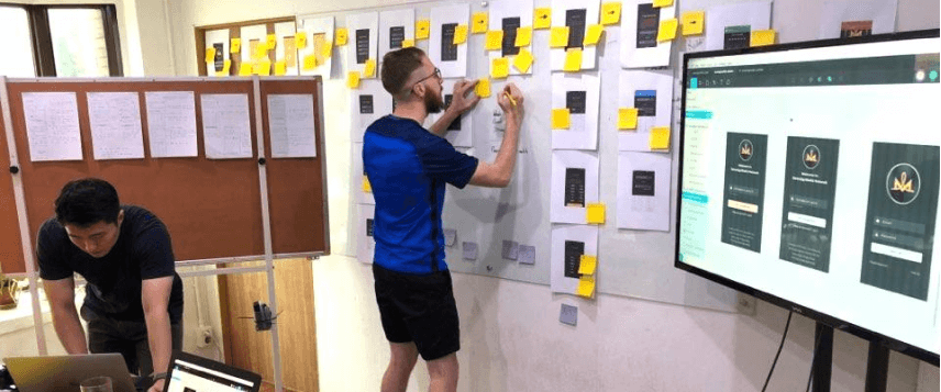
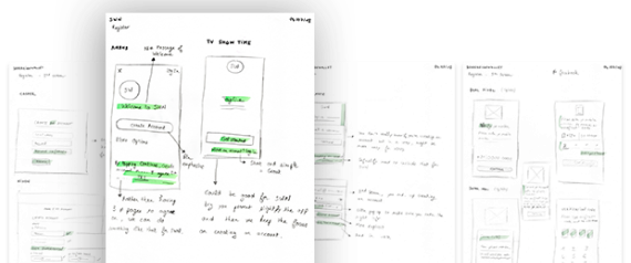
Scene 03|03 - prototype
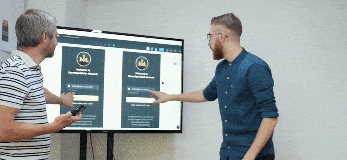
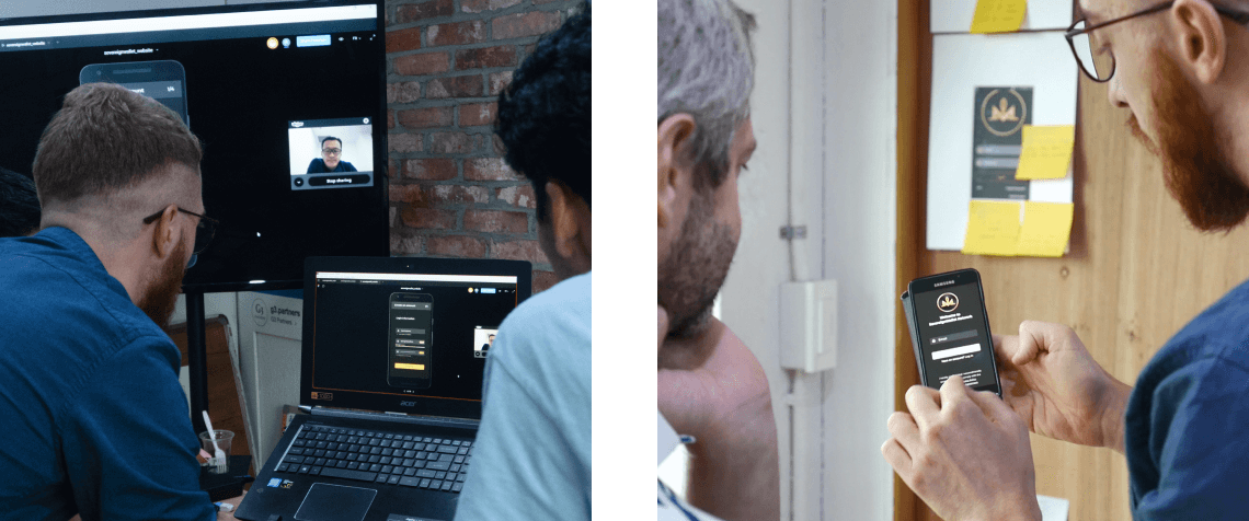
I used Figma and its prototype tool + Figma Mirror available on mobile to share our ideas and explore different options. I invited SovereignWallet’s engineers to our office and Skype with their team in Singapore to present them our ideas and directions.
stage 04
solving the problem
design
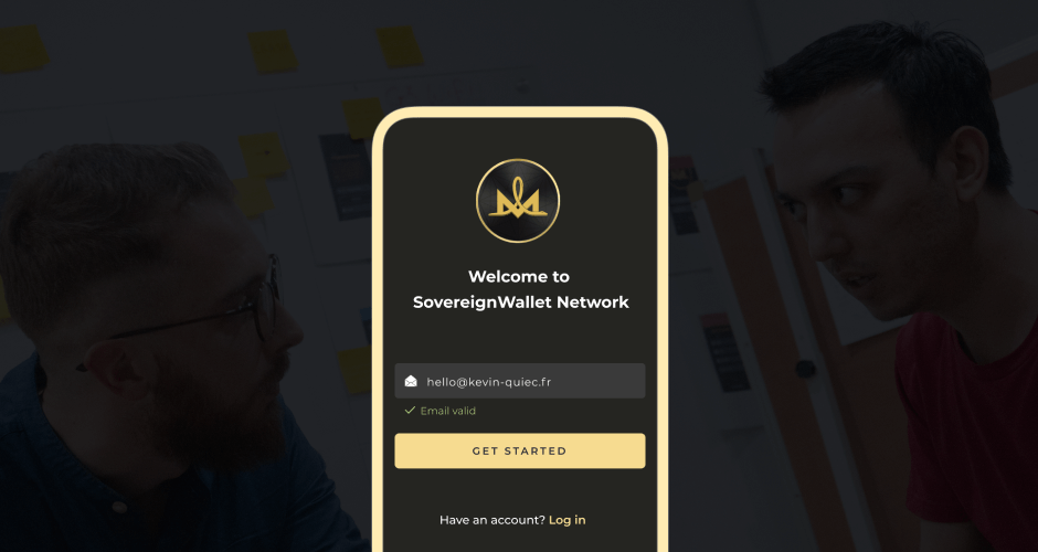
Scene 01|05 - get started
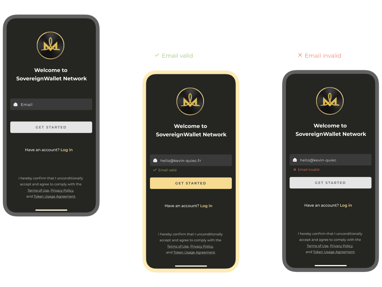
Scene 02|05 - login information
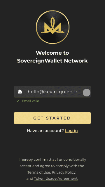
To help the users throughout the process, I placed some hints close to the inputs. On the top, I added a progress bar for the user to see at which step of the onboarding process he/she is. As the process is quite long, it’s important that the user sees the progress.
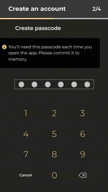
Scene 03|05 - create passcode
To make the app more secure and to protect the user’s personal information in the case of theft, the SovereignWallet app requires a passcode that users enter each time they open the app. This is something that I felt was important to emphasize compared to the previous version, and this is why I added a reminder.
Scene 04|05 - account security
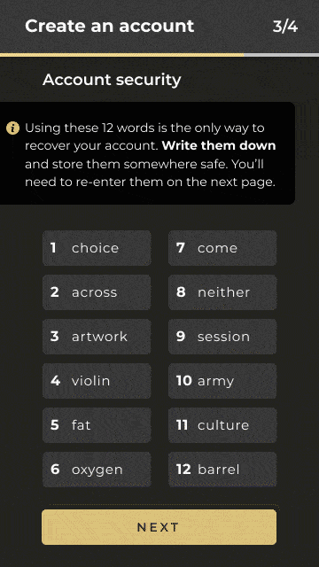
This step was the most confusing in the previous version of the app but for security reasons, I was asked to keep it. I was, however, able to make the step as clear as possible with the reminder. To make sure that all the inputs were correct, I showed clear Call To Action in different colors.
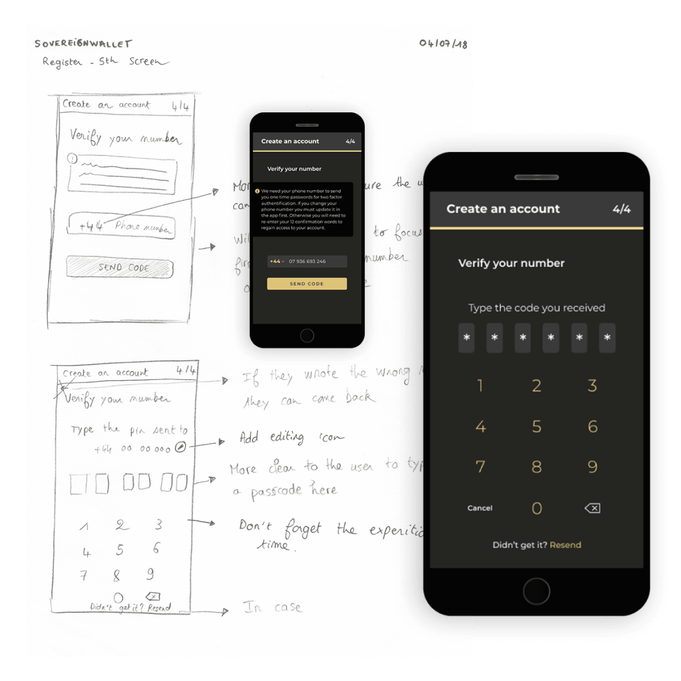
Scene 05|05 - verify your number
Last but not least, the verification of the phone number. On the previous version, the inputs for both the phone number and the code were on the same page, forcing users to scroll down to see. On the new version, I decide to split them into two separate pages- phone number first and code next - to make each step more visible and hassle-free.
stage 05
(re)solution
ending the story
Our goal was to improve the user experience simple and intuitive design, while keeping the brand identity intact throughout the app.. We made the registration process much easier for the users with improved interface and instructions. Despite the constraint of regulation, we successfully reduced the number of steps for the users to register and apply for KYC.
extra
details & links
Date
2018
Team
- 1 product designer (myself)
- 4 developers
- 1 business owner
My responsibilities
 Mobile apps (Android app)
 Website
Redesigned since
selected works
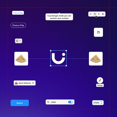
Uizard - AlchemyDesign System | READ →
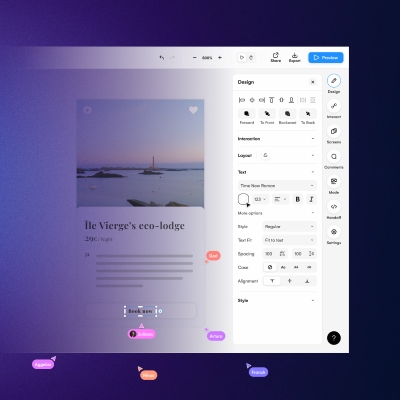
Uizard - Design tool for non designersWeb App | READ →
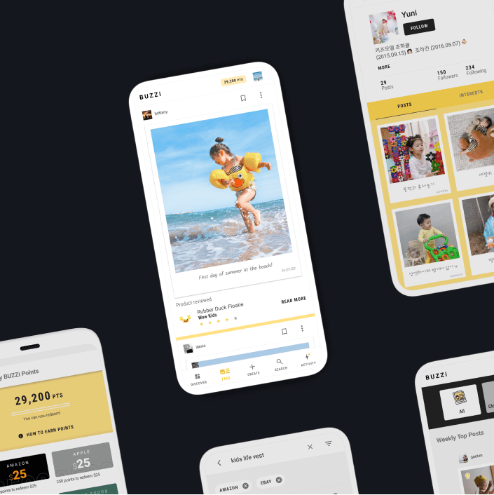
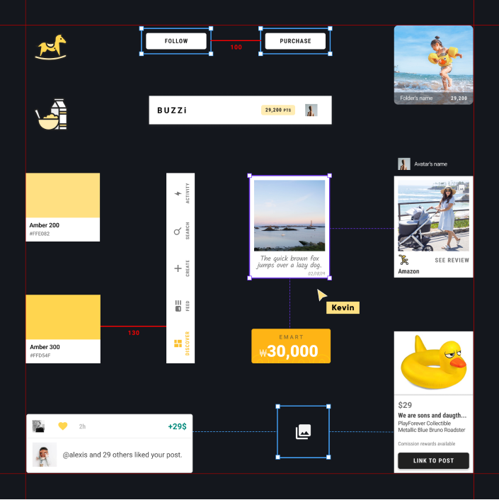
Buzzi - Product review platformMobile App [Android + IOS] | Multi-language | READ →
Merch SquareDesign System | READ →
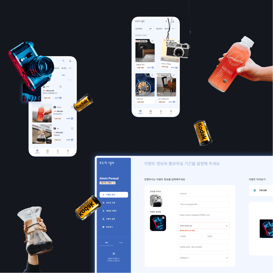
Moduseller - Ecommerce platform for Korean influencersMobile App [Android + IOS] + Dashboard | READ →
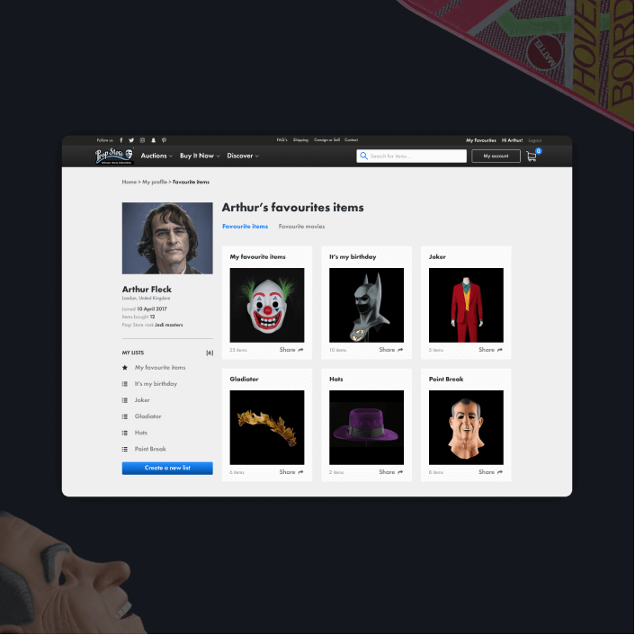
Prop Store - Vendor of original movie propsWeb App | READ →

Want to say Hi? 
hello@kevin-quiec.fr
+33 6 06 41 58 13
Explore my social media